

Pines, Kempenfelt Bay
Lindsey McTavish is a Toronto-born artist, currently living and working in The beautiful mountain town of Nelson British Columbia, Canada. Designer, mother, artist & entrepreneur, she is inspired by color & texture, the Canadian landscape, the diversity of the female form & her surrounding environment. Having studied Fibre Arts for 3 years at The Kootenay School of The Arts in Nelson, B.C, followed by 2 years at the Academy of Design in Toronto where she graduated from the Fashion Design program, Lindsey has made a successful career of selling her line of Clothing & Handbags under the namesake label of Lindsey M Collections and is also one of the proud owners of the CRAFT CONNECTION GALLERY in Nelson B.C.
The Gallery is owned and operated by a small group of dynamic female artists & designers, who carefully curate & display an excellent collection of works from over 200 artists and craftspeople from across the country.
You can find Lindsey’s work there year-round, and in other various shows & exhibits throughout the year In Canada as well as in many other International & online exhibits year round.
The following pieces are made by hand felting then quilting (with an industrial sewing machine), un-spun sheep’s wool & silk, Some of the more detailed subjects are needle felted first, and then laid on the background and wet felted together to bind and join the components together.
Wet felting is the process of manipulating sheep’s wool with soap and water and layers until the fibers bind together and become a non-woven “fabric”.
Because of its durability, felting has been used to make many functional items throughout history, such as yurts that are lived in by nomadic Mongolians, rugs, jackets, slippers, hats, etc…
As for my use of it, I am creating 2 dimensional, ”felted tapestries”. In my work, you’ll often see painterly-like scenes that I refer to as Feltscapes – landscapes & scenes that are reminiscent of works by members of the Group of Seven, although I’m also often inspired to work on other subjects that I find myself interested in, such as people, birds, animals, florals & abstracts.
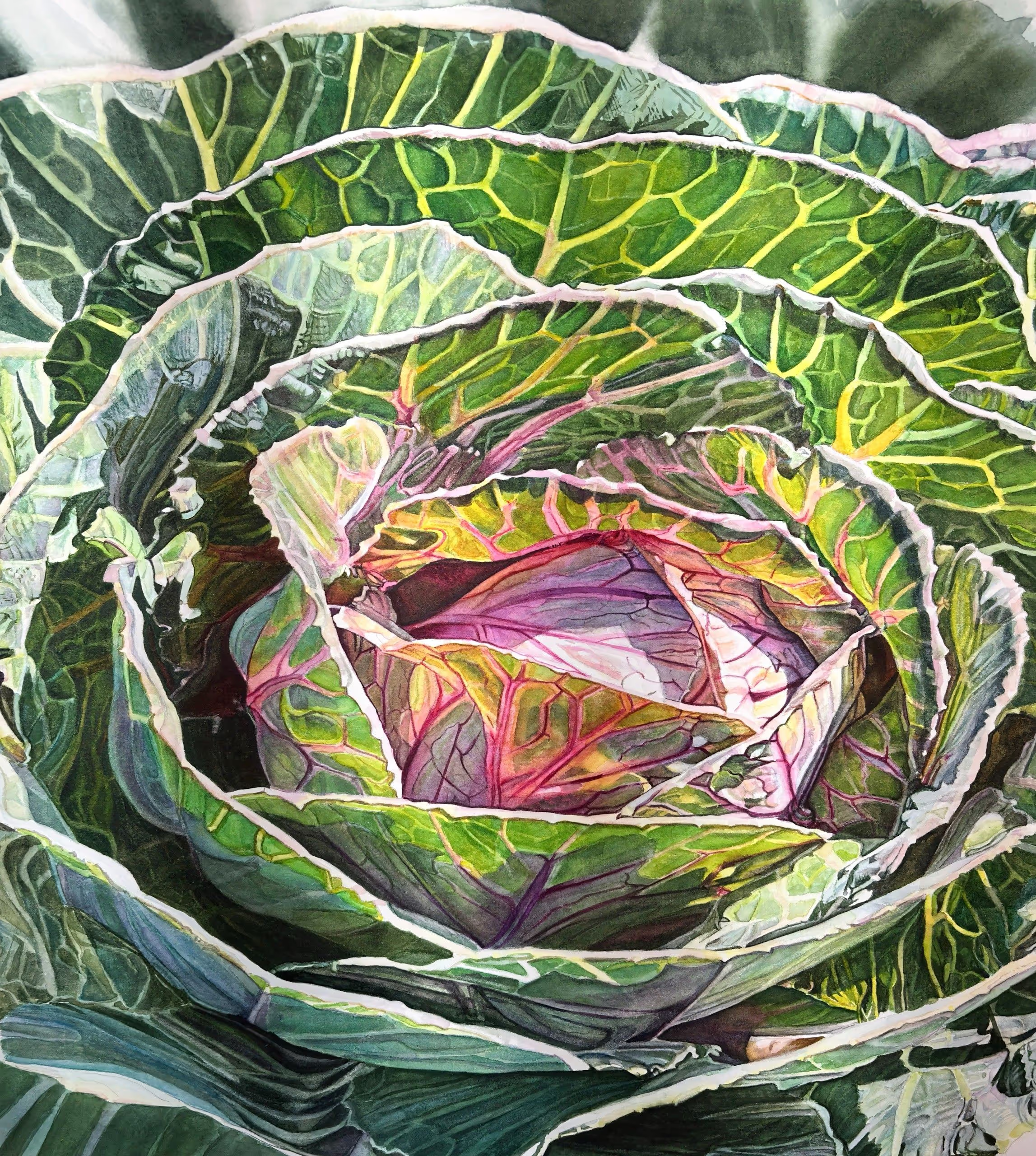
Pink And Green
Karen Romani is a watercolor artist living in the Midwest. She’s originally from New York, but decided to go to St. Louis for college and decided to stay. She married after college and has 3 wonderful grown children and 5 grandchildren. Her art journey started after retiring from a career as a Physical Therapist. Always creative and looking for something fun to do, she came across a watercolor class. From that moment, she was hooked. Her career in art has allowed her to meet a wonderful group of people and taken her to places she only dreamed of going to in the past. Karen joined several art guilds, became a Signature Member of several Societies around the country, and has entered and won awards in some of the country’s most prestigious societies.
As a member of the American Society of Botanical Artists, Karen has attended the annual conference, enabling her to take classes with some of the best botanical artists around the world.
Karen is presently teaching and sharing her art with galleries in St. Louis and around the country. Karen couldn’t think of a better way to spend her retirement years, which includes spending time with her children and grandchildren.
Botanical art has been my focus for several years, working in watercolor and encaustic wax. I’ve dedicated my energy to education and practice of all forms of flora, mostly representational work. The more detailed, the better. My work is vivid, with a focus on intense colors, especially lights and darks. Vegetables, especially cabbage, have caught my attention. These ornamental cabbages have a variety of colors and interesting forms. These paintings are so fun to paint.

Pink Hollyhocks
Steve Walag has been a photographer for nearly 50 years. He earned a Bachelor’s degree in English and Religious Studies from the University of California, Riverside (UCR) and a BFA in Photography from Art Center College of Design in Pasadena, California. He has enjoyed a varied career as a photojournalist, public relations photographer, freelance architectural shooter, photo instructor, and campus photographer at Inland area schools (UCR and Riverside City College). All the while, Steve has pursued his artistic path on the side, beginning decades ago with a strong affinity for the black and white photography of the West Coast “straight” photo school. It is only since 2015 that his attraction to Japanese art led him to formulate the style shown here.
Although Steve’s images may resemble paintings, they are in fact digital photographs printed on textured paper. They were inspired by traditional Japanese paintings in the centuries-old Rinpa tradition. Rinpa artists favored simple, natural subjects – flowers, trees, birds, and landscapes – set against a plain or minimized background. Steve’s fascination with Japanese art led him to emulate those works using digital imaging, lighting, software, and printing techniques.
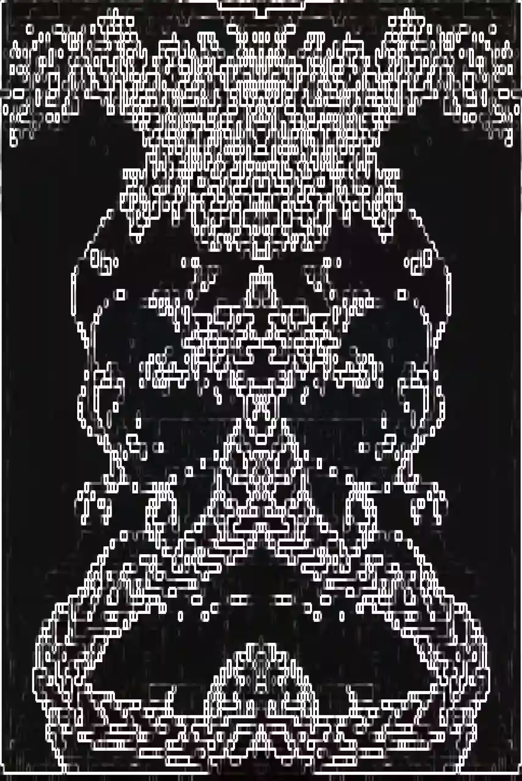
Pixel Rose
As an Irish-born Artist and Poet, Chadains’s work is heavily inspired by ideas of fantasy, classism, and the movement of feminism concerning the rise of the 4th industrial woman and her place in society. Chadain’s art and poetry have been exhibited and published worldwide, from featuring in Poetry Ireland’s Queer Anthology of the next generation of Irish Creatives, to work exhibited from Serbia to the USA.
My hyper-feminine imagery and style are used to discuss our modern distaste for femininity, despite its allure. This a perfect dichotomy with modern cultures’ obsession with beauty but contempt of feminine interests, impressions, and representations.
My practice is partly born from my aphantasia and astigmatism, quirks that leave me unable to visualize normally, something which lends itself well to my continuous iteration process.
I merge my experience as an outsider artist with my intersectional feminist and classical lens. I studied the classics, both in texts like Medea and in the art to give myself an understanding of what was created in the male gaze so I could truly paint my feminine subjects and femininity from an informed gaze. An art movement is never finished until every gaze is seen and every story is accounted for.
I prefer to engage the viewer in the intersection of poetic language, technology, and visual symbolism to discover the impact of my ideas on the viewer, emotionally challenging the viewer on their preconceived notions of what it means to be feminine.

Pocket Change
Amy Lewis is a self-taught artist from Washington state. Her watercolor and oil paintings are vivid lifelike snapshots of ordinary life glamorized. Amy, inspired by fashion editorials and historic paintings of aristocracy, pairs everyday objects with rich backgrounds. The juxtaposition of the ordinary and the luxurious sparks an appreciation for the things we take for granted. She paints to cultivate joy and an appreciation for the beauty that is all around us.
My work is a practice of gratitude. It is the cultivation of joy and an appreciation for the beauty that is all around us. I’m constantly exploring ways to portray ordinary life as glamorous. Everyday objects with luxurious backgrounds create a juxtaposition that sparks an appreciation for the things we take for granted. In the beauty of the ordinary, I am reminded to be grateful and to use my privileges for the good of others. Fashion editorials and historic paintings of aristocracy are rich sources of inspiration. I work in watercolor and oil paints. For watercolors and oil paintings, alike, I paint roughly 3-4 layers. Many layers mean that the resulting painting has a smooth finish and vivid complex colors. Depending on the size, medium, and complexity of a piece they can take 1-2 days or 1-2 months. Most recently I am proud of being featured in Gita Joshi’s Art Seen Magazine and throwing my own group art exhibition in Seattle, WA.

Poetic Musings
Amy Lewis is a self-taught artist from Washington state. Her watercolor and oil paintings are vivid lifelike snapshots of ordinary life glamorized. Amy, inspired by fashion editorials and historic paintings of aristocracy, pairs everyday objects with rich backgrounds. The juxtaposition of the ordinary and the luxurious sparks an appreciation for the things we take for granted. She paints to cultivate joy and an appreciation for the beauty that is all around us.
My work is a practice of gratitude. It is the cultivation of joy and an appreciation for the beauty that is all around us. I’m constantly exploring ways to portray ordinary life as glamorous. Everyday objects with luxurious backgrounds create a juxtaposition that sparks an appreciation for the things we take for granted. In the beauty of the ordinary, I am reminded to be grateful and to use my privileges for the good of others. Fashion editorials and historic paintings of aristocracy are rich sources of inspiration. I work in watercolor and oil paints. For watercolors and oil paintings, alike, I paint roughly 3-4 layers. Many layers mean that the resulting painting has a smooth finish and vivid complex colors. Depending on the size, medium, and complexity of a piece they can take 1-2 days or 1-2 months. Most recently I am proud of being featured in Gita Joshi’s Art Seen Magazine and throwing my own group art exhibition in Seattle, WA.
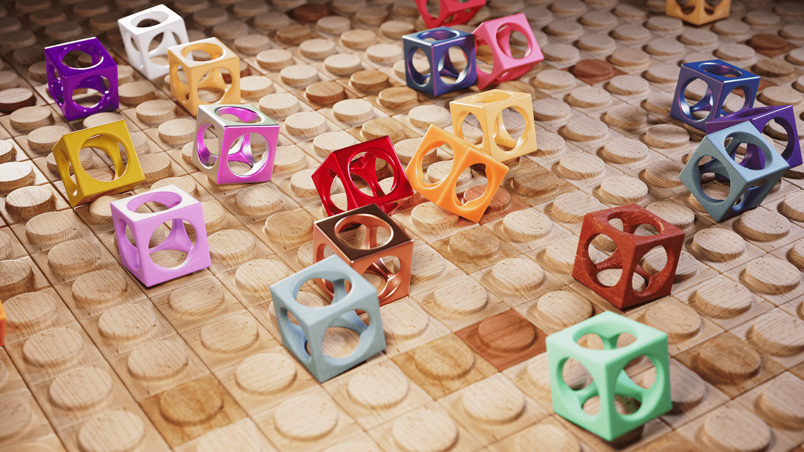
Points Of View
For 3 decades, Peter Hriso has worked as an artist and animator in various positions. He is a Professor of Digital Animation and coordinates the MA in Art and Design program at Kennesaw State University. He imparts his knowledge and expertise to students by teaching undergraduate and graduate courses in animation and motion design.
Peter Hriso has been a dedicated artist and animator for more than three decades, holding various positions in the field. He currently serves as a Professor of Digital Animation at Kennesaw State University, where he also coordinates the MA in Art and Design program. Through his teaching of animation and motion design courses at both the undergraduate and graduate levels, Peter shares his wealth of knowledge and expertise with his students.
My work investigates repetition, modularity, and rhythm within digital space, exploring how simple geometric forms can accumulate into complex architectural landscapes. Using 3D animation software, I construct layered systems of blocks and tiles that balance order with subtle irregularities. The interplay of opaque, translucent, and textured surfaces creates shifting patterns of light and depth, transforming static structures into dynamic visual experiences.
These compositions—ranging from stacked translucent panels to painted cubes and soft, fabric-like blocks—highlight the tension between rigidity and softness, as well as uniformity and variation. Each piece becomes a meditation on structure and fragility, evoking both digital precision and tactile materiality. By abstracting architectural and industrial references into playful, modular forms, I invite viewers to reflect on how repetition and variation shape the environments we inhabit, both in reality and in imagination.
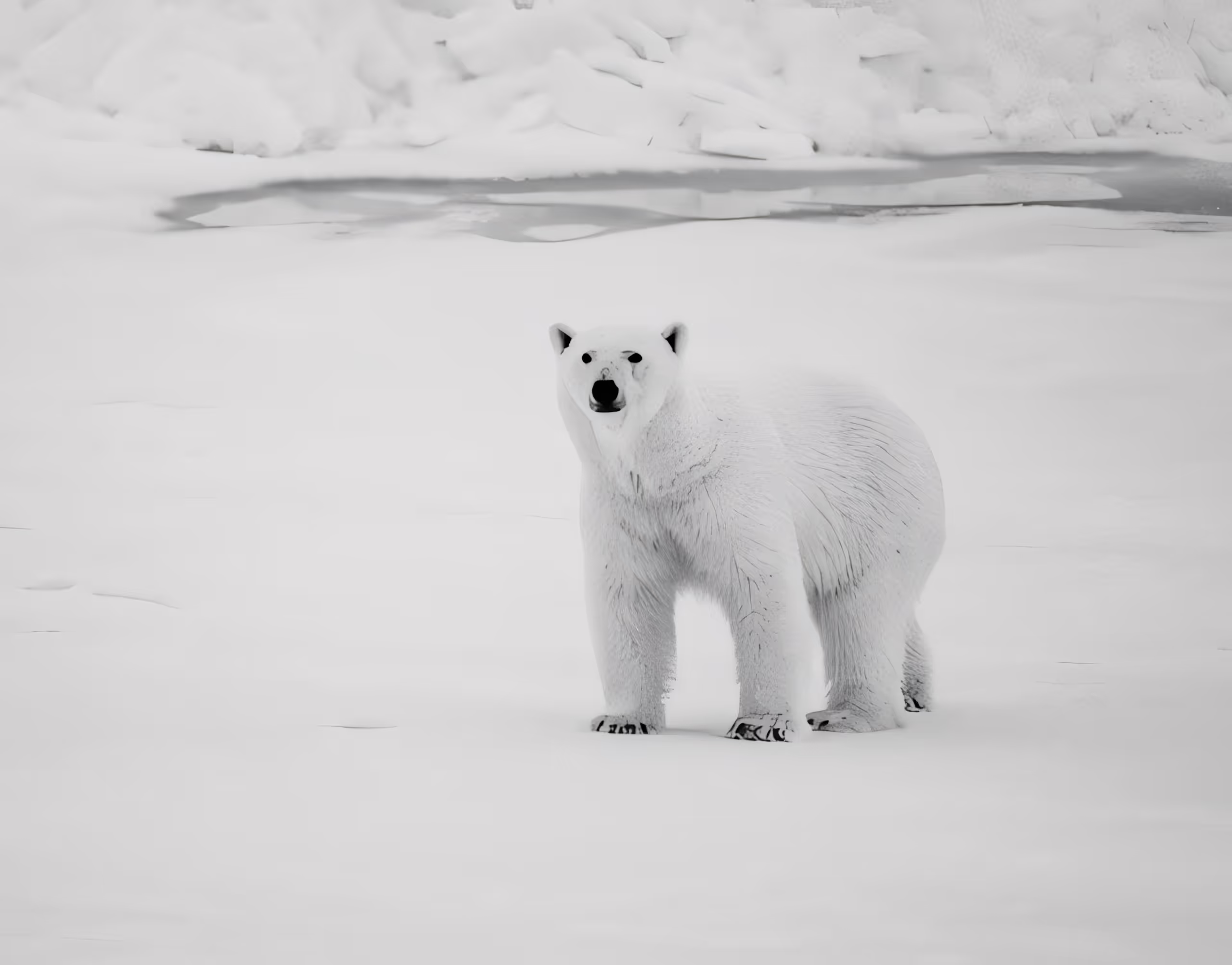
Polar Solitude
Mital Patel is a fine art photographer whose work explores the relationship between form, minimalism, and emotional presence in natural environments. His imagery often focuses on isolating subjects within vast landscapes, using light, scale, and restraint to create a sense of stillness and contemplation.
Working across wildlife and remote environments, Patel’s recent work has shifted toward more minimal and conceptual interpretations of nature, where composition and tonal control play a central role.
His work has been exhibited and recognized internationally, with a growing focus on fine art presentation and gallery-based storytelling.
Ice exists in a narrow spectrum of tone, where color is restrained, and form becomes the primary language. In this body of work, I explore the Arctic as a study in subtle variation shifts in light, texture, and scale within a limited palette.
Each image isolates a different presence: dominance, stillness, and quiet transience. The restrained blues and greys are not just aesthetic choices, but a way to remove distraction and focus attention on structure and atmosphere.
By working within a singular color space, the landscape becomes less about place and more about perception, where form, silence, and scale begin to dissolve into something introspective.
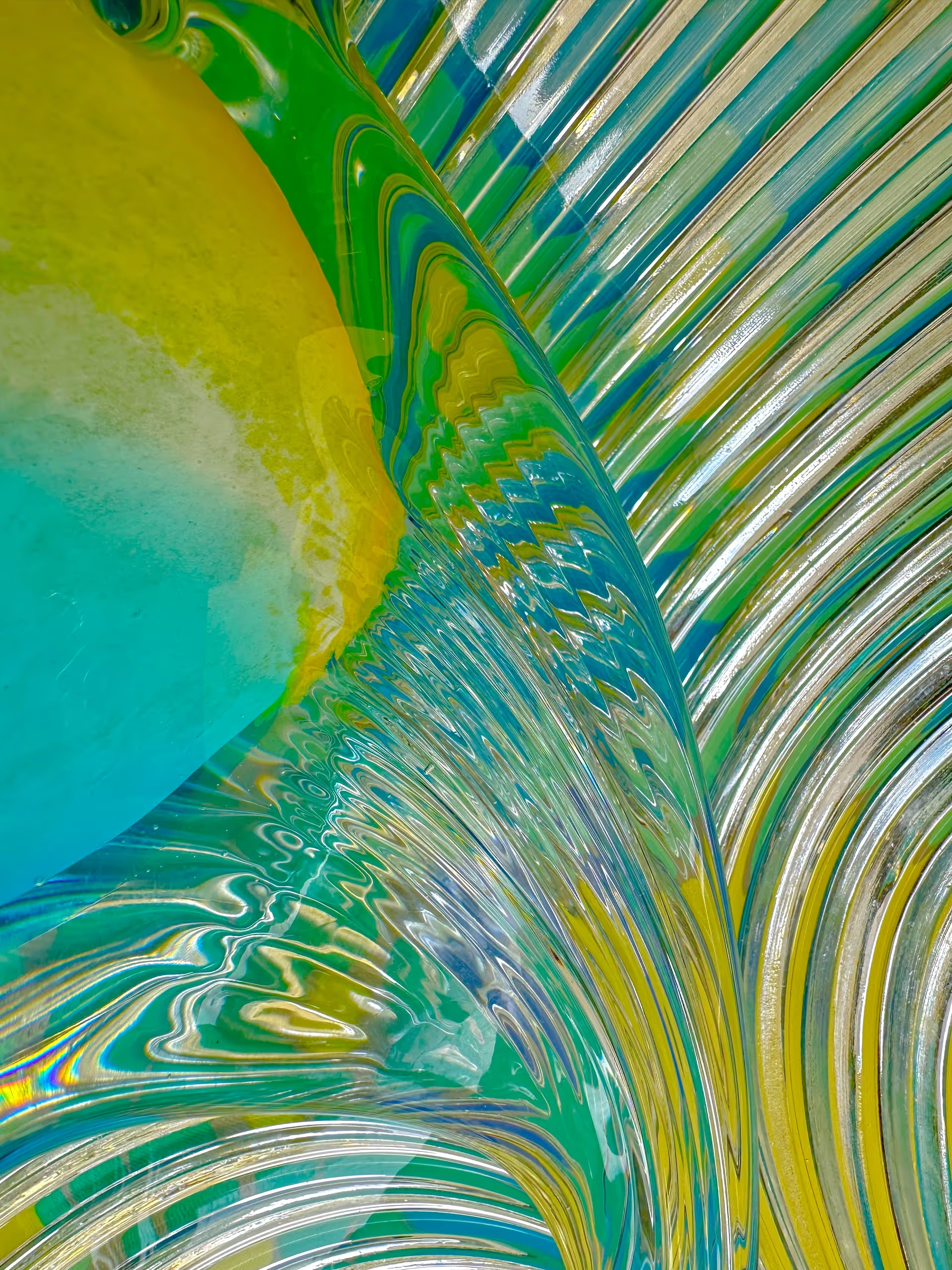
Pollinate Please
At 65, after decades of not creating art, Lisa Joy Newcomb reinvented herself as an artist.
Ms Newcomb has been honored with one best-of-show, four first-place awards in photography, a second-place award in abstract photography, and a third-place award. She has had three one-woman shows. One through Artel Gallery, one through the University of Delaware, and now one through HMVC Gallery, New York. Her work has been seen from coast to coast, including several times through the HMVC Gallery in New York and the Las LaGuna Gallery in California. Pictorem, based out of Montreal, Canada, has Lisa as a featured artist. Ms. Newcomb’s work has been seen in public arenas including New York’s Times Square electronic billboards, Montgomery International Airport, the Regions Bank Corporate Gallery in Montgomery, Alabama, the Sanger Theater in Pensacola, Florida, and the Hilton Hotel Pensacola Beach, Florida. Two books have also been presented to Lisa Joy Newcomb. They are: “Nobis II, 2023” and ”Emerald Coast Review, 2023”.
The photographs she creates are abstractions in fluidity, rich in joy and filled with color, pattern, curiosity, and a gentle message. The dance of light that for most of her life she sought in the ocean, she is now looking for in the melding of glass and fabric, with occasional surprise elements. Lisa’s work is usually printed on aluminum using high-definition ChromaLuxe sublimation.
Ms Newcomb’s highest degree is a master’s in social work. Professionally, she worked as a social worker and as a realtor. She was raised in the Mid-Atlantic, experienced her young adulthood in New England and the Midwest, and for the last 28 years, the Deep South has been home with her husband. It was in the Deep South that she raised an interesting, dynamic, kind-hearted daughter. Lisa was a docent sequentially at the Pensacola Museum of Art and the Montgomery Museum of Art for over 17 years. She is currently a national member of Pen Women.
Ms Newcomb’s uplifting work can be seen on her website at Pictorem. You may order there to your specifications.
I create photos as peaceful, playful, healing stimuli while I make observations of humanity and the environment. Drawing upon different objects, I explore melding them into a unified whole. Part of my process is setting up compositions, in the form of an assemblage, visually weaving together beautiful glass, flowing fabric, with vibrant colors and patterns into integrated fluid formations, seeking to reshape light, pattern, and color into a visual oasis. I then tightly crop and photograph. My intent is to transcend and transform objects into images that visually excite while calming the soul, often with a gentle message.
A lifelong passion for art and artists influenced my work. I nod to Miriam Schapiro, a leader in the Pattern and Decoration Movement. Having lived much of my life by the shore, I have always loved the play of light in watery reflections. I am drawn to artists who capture light. Sand Stephen Rolfe Powell’s glass delights me. Mark Rothko believed in the visceral effect of color. He wanted people to have an experience within his pictures. I seek to have my work viscerally effect the viewer.
CromaLuxe high definition images printed on aluminum are my preferred substrate. The reflective surface enhances and enriches the dynamics of the glass used in my imagery. Images can be ordered in small jewel-like prints or large dynamic pieces.