
Aphrodite
Heini Mika is a Finnish artist who works and resides in New York City. Heini has a BA degree in Fine Arts from the University of Worcester (UK) and a Fine Art and Visual Communications degree from the Pekka Halonen Academy of Art (Finland). She has exhibited her paintings worldwide, most notably in The United Kingdom, United Arab Emirates, Indonesia, and New York. Her paintings have been published in a variety of magazines including the British Vogue and some of her artworks are held by private collectors.
Heini’s contemporary paintings serve the viewer with a palette of vibrant colors and dynamic shapes while she gives you her unique perspective on women, fairytales, and history. They have been an essential source of inspiration for Heini throughout her career as an artist and this can be observed in her rich and intriguing original artworks. Heini Mika is also the co-founder and chief curator at her own online art gallery the HMVC Gallery New York.
For the longest time, women have always been the subject of great art, but rarely were we allowed to create great art. Being a female artist in the 21st Century, I look to my female heroes for guidance and inspiration. From Marie Antoinette to Miley Cyrus I paint my subjects the way I see them, inspiring, beautiful, and most importantly, complex. There is so much more to these women than meets the eye, yet all of them were or are dismissed at face value.
In my acrylic paintings, I explore the dichotomy between my female subjects and their personal stories. While my almost cartoonish art style may play into the notion that these women are ditzy and childish, my intention is to tell their true stories. These women have inspired me, and while I wish to emulate their pop culture selves, I am aware of the darkness that lurks behind the fun. To convey this darkness I like to paint moments from their lives that don’t play into the notion of fun and positivity. I chose to work with acrylics because as a medium they are as bright as an artist’s medium gets. This naturally plays into my exploration of my subject’s pop culture image. It’s fun and colorful, yet if you look twice, there’s still the true story behind my fun image.
My painting style is dynamic, colorful, and intriguing and with that, I want to invite the viewer to look at the women I admire. And to remind everyone that when it comes to women, there is so much more than meets the eye.

Aphrodite
Nikki is a Fine Artist based in the South Lakes, Cumbria, UK. Nikki studied Theatre Design in Birmingham before completing a PGCE in Lancaster and a MA in Film and TV Production Design in Kingston. After completing her studies Nikki went on to be Head of Art and Design, Photography, and Media Studies in a school outside London before moving back to the Lake District in 2010. Nikki currently teaches full-time A-level and Post 18 Art, Design, and Photography as well as working on her own creative practice. Nikki has always worked on her own creative practice whilst working full time and completed commissions over the years in a variety of media and subject matter as well as being a lifestyle and wedding photographer for a short time.
Nikki lives with her Italian husband and two boys and can be found avidly reading or walking their beagle in the beautiful surroundings of the Lakes when she isn’t teaching or being creative.
When I consider my own artwork, I often struggle to find the words to describe my work, creating art is a need for me, to unload my thoughts and emotions. My artwork comes from within and often contains locations or motifs that are personal or from my surroundings. I have always enjoyed color and nature, and when I paint, I love exploring different color palettes to provoke different emotions and feelings. Art to me should be something to be enjoyed and bring different meanings to those who look upon it.
I enjoy working with portraits, the human face can show a variety of emotions and can create mystery and intrigue. I have a passion and love for lighting, color, and a sense of narrative within my work due to my background in film. My love of narrative and storytelling within the image, I hope creates intrigue and invites the viewer to interpret ideas for themselves, to question and be thoughtful.
During the pandemic, painting was my lifeline. I enjoyed rediscovering color within portraiture and using elements at juxtapositions to develop compositions that created new ideas. My work contains motifs of floral elements associated with emotions, feminine traits, and awareness of balance within compositions, through color and texture. The lockdown gave me time to re-energize my artwork and reflect inwardly to express outwardly in my painting. Through expressing floral elements, I have explored the Queen of flowers the peony in recent work. A flower that can bring joy and beauty into the world during some dark times. These flowers represent regrowth, strength, and resilience as well as feminine beauty and softness. My most recent work has explored Goddesses and the divine feminine with symbolism within the flowers selected, colors, and other elements helping to tell a story.

Apples And Strawberries
John was born in Columbus Ohio, graduated from Ohio State, and lived in Southern California for 30 years. Although John learned to draw and paint as a young boy, his degrees are in the computer science field. It wasn’t until 2010 when his wife bought him a large easel and encouraged him to start painting again, that he began to take his art career seriously. Since then John has been selected in over 200 gallery shows and juried contests, including the National Oil & Acrylic Painter’s Society 2014 Best in America show. John’s Carousel Horse #1 was featured in the June 2014 issue of the Artist’s Magazine Competition Spotlight, and he was featured in the ‘Artists to Watch’ section of the Southwest Art March 2016 edition. John’s acrylic paintings have been included in AcrylicWorks Best of Acrylic Painting volumes 1 through 10 and his paintings have been voted FAV15% in Bold Brush on a number of occasions.
I was sitting at the bar at a local restaurant one evening and noticed the cascading reflections from the dozens of bottles of liqueur on the glass shelves. I knew immediately that I wanted to paint the scene. As I started gathering photo references my thoughts coalesced around the idea of glass bottles as precious objects. The shapes sizes and colors of the glass and the liquid inside all meld together to sparkle like gemstones.
I had painted several works that featured reflections in water, but never glass bottles. My goal was to get the viewer to see something more than bottles of booze. Some shiny objects that glitter and sparkle.

Approaching Storm
Lindsey McTavish is a Toronto-born artist, currently living and working in The beautiful mountain town of Nelson British Columbia, Canada. Designer, mother, artist & entrepreneur, she is inspired by color & texture, the Canadian landscape, the diversity of the female form & her surrounding environment. Having studied Fibre Arts for 3 years at The Kootenay School of The Arts in Nelson, B.C, followed by 2 years at the Academy of Design in Toronto where she graduated from the Fashion Design program, Lindsey has made a successful career of selling her line of Clothing & Handbags under the namesake label of Lindsey M Collections and is also one of the proud owners of the CRAFT CONNECTION GALLERY in Nelson B.C.
The Gallery is owned and operated by a small group of dynamic female artists & designers, who carefully curate & display an excellent collection of works from over 200 artists and craftspeople from across the country.
You can find Lindsey’s work there year-round, and in other various shows & exhibits throughout the year In Canada as well as in many other International & online exhibits year round.
The following pieces are made by hand felting then quilting (with an industrial sewing machine), un-spun sheep’s wool & silk, Some of the more detailed subjects are needle felted first, and then laid on the background and wet felted together to bind and join the components together.
Wet felting is the process of manipulating sheep’s wool with soap and water and layers until the fibers bind together and become a non-woven “fabric”.
Because of its durability, felting has been used to make many functional items throughout history, such as yurts that are lived in by nomadic Mongolians, rugs, jackets, slippers, hats, etc…
As for my use of it, I am creating 2 dimensional, ”felted tapestries”. In my work, you’ll often see painterly-like scenes that I refer to as Feltscapes – landscapes & scenes that are reminiscent of works by members of the Group of Seven, although I’m also often inspired to work on other subjects that I find myself interested in, such as people, birds, animals, florals & abstracts.

April
Born in Beacon NY, Mark is an artist based in Las Vegas, who is known for his impressionist paintings that capture people, places, and the events in his life. Timeless and tasteful, or modern and messy, images in his life demand to be examined. Mark often uses acrylic paint to create highly textured, three-dimensional works on canvas. A graduate of San Jose State’s art program, Mark’s first influence was his great uncle, Alfred Pizzarelli, an artist from New York City in the 1950s-60s. When admiring his uncle’s wonderful paintings, Mark would daydream about the people he painted, and interpret their expressions and colorful surroundings. Mark’s paintings are meant to burst with energy, life, and texture, beckoning the viewer to engage with the same wonderment he experienced as a child. You can find Mark’s artwork across Las Vegas in restaurants, wineries, and local galleries. When Mark’s not working, he’s spending time with his wife, Alicia, and their English bulldog, Belma.
So many things I think about when I look far away. Things I know, things I wonder, things I’d like to say.
After 20 wonderful years of painting, I decided that it was a perfect time to explore different landscapes. After months of researching different regions, I settled on Nara Park Japan. I found the history and landscapes to be intoxicating.
My artwork is a direct reflection of the different seasons of the park. I like to work in acrylics on canvas to enhance all the emotions and colors that Nara has to offer. I use bright or muted colors to communicate the magic and essence of the ever-changing seasons. Even as I branch out to other mediums or subject matters, I’m always tempted to come back to Nara Park.
If a viewer stops for just a moment to reflect on a piece I have created and feels emotion from the thousands of colors captured on canvas that reflect the different seasons, then I have succeeded in my work.

Aquarium
Ronaldo Byrd was born and raised in Brooklyn, New York. He is a Contemporary Hip “Pop” Artist who began painting at the tender age of 3. As an early teen, Byrd was accepted to and attended Art Instruction School, which boasts graduate, Charles Schulz. He graduated and received a Diploma in Art from Art Instruction School at age 16. While enrolled in the course, Byrd was also attending The High School of Art and Design in New York City, before moving to Burlington, New Jersey. Byrd then was accepted to and attended Burlington County Institute of Technology, where he majored in and received a Diploma in the field of Advertising Art and Design. Byrd is mostly a self-taught Artist who has developed his own style of art and his own characters, which he puts in phenomenal scenes. He has shown his work in several galleries, including a solo show at Michigan Medicine in Ann Arbor, Michigan. Byrd and his artwork have also been featured in several newspapers and magazines. One of which includes, The Philadelphia Inquirer. He has also been a feature story on CBS 3 Eyewitness News. Byrd’s message to the world through his artwork is one of love and acceptance. His hope is to convey this as boldly and as beautifully as he can.
I am a Contemporary Hip “Pop” Artist who just happens to be on the Autistic Spectrum. My artwork focuses on the fact that everyone is beautiful regardless of race, color, ethnicity, gender or sexual orientation. The bold colors I use represent the way I see the world. There is beauty in everything I see and I believe that everyone has something to offer to the world in their own special and unique way. Thus, I have been deemed “The Artist of Happiness” because of the joy that my artwork brings to countless people. My art and I represent differences and my hope and goal is for the entire world to be able to see beauty and acceptance through my eyes—-the eyes of an artist.
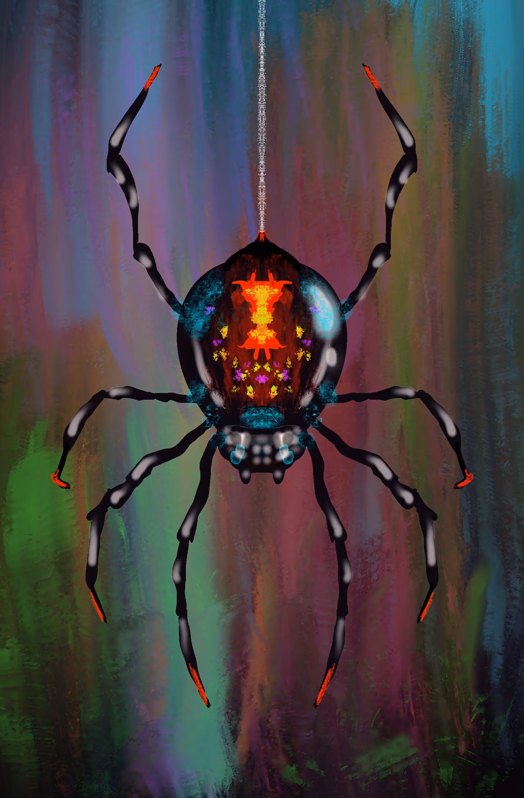
Arachnid Specimen
Jared Konopitski is an artist living and working in Sacramento, California. Jared works in many mediums; however, he primarily works with acrylic paintings. Jared has worked with many clients such as Art O Mat, Turning Art, Wide Open Walls, and more. In addition, Jared has curated numerous gallery shows and corporate art seminars. In his spare time, he enjoys facilitating art workshops with a focus on early art education. His work has been exhibited at galleries, festivals, and museums across the US and internationally, including:
The Smithsonian, Washington, D.C.
The Crocker Art Museum, Sacramento, CA
The Mutter Museum, Philadelphia, PA.
Stranger Factory, Algodones, New Mexico
Giant Robot, Los Angeles, CA
Baton Rouge Gallery, Surreal Salon, Louisiana
Jared has had his work seen in:
Adbusters Magazine(2023)
Juxtapoz.com (2018)
PBS Art Showcase television show (2015 – 2017)
The New Yorker (2014)
Color Ink Book (2013)
Papercut Magazine (2013)
Arcana’s Steampunk Originals (2013)
Heavy Metal Magazine (2012)
Catapult Magazine (2012), DisColouring Book (2012)
Penumbra eZine (2012)
And Wow! Cool! Psycho Nurse Calendar (2011)
Awards:
KVIE Art Auction Curator Award – 2019
I am inspired by all things beautifully weird, such as monsters, the bugs living under the rocks, creatures in jars, ghosts, all the nooks and crannies of nature. But I am also inspired by comics, cartoons, noise music and neon anything. So I try to paint the way these things make me feel. Sometimes it comes out fun, sometimes scary, sometimes cute, and sometimes ugly. But I love it all. I prefer painting with acrylics on wood. And after the acrylics are laid down, I love to go over everything with black Ink. The black ink brings out the detail and gives the whole painting a better sense of flow.

Arashiyama At Night
Born in Beacon NY, Mark is an artist based in Las Vegas, who is known for his impressionist paintings that capture people, places, and the events in his life. Timeless and tasteful, or modern and messy, images in his life demand to be examined. Mark often uses acrylic paint to create highly textured, three-dimensional works on canvas. A graduate of San Jose State’s art program, Mark’s first influence was his great uncle, Alfred Pizzarelli, an artist from New York City in the 1950s-60s. When admiring his uncle’s wonderful paintings, Mark would daydream about the people he painted, and interpret their expressions and colorful surroundings. Mark’s paintings are meant to burst with energy, life, and texture, beckoning the viewer to engage with the same wonderment he experienced as a child. You can find Mark’s artwork across Las Vegas in restaurants, wineries, and local galleries. When Mark’s not working, he’s spending time with his wife, Alicia, and their English bulldog, Belma.
So many things I think about when I look far away. Things I know, things I wonder, things I’d like to say.
After 20 wonderful years of painting, I decided that it was a perfect time to explore different landscapes. After months of researching different regions, I settled on Nara Park Japan. I found the history and landscapes to be intoxicating.
My artwork is a direct reflection of the different seasons of the park. I like to work in acrylics on canvas to enhance all the emotions and colors that Nara has to offer. I use bright or muted colors to communicate the magic and essence of the ever-changing seasons. Even as I branch out to other mediums or subject matters, I’m always tempted to come back to Nara Park.
If a viewer stops for just a moment to reflect on a piece I have created and feels emotion from the thousands of colors captured on canvas that reflect the different seasons, then I have succeeded in my work.
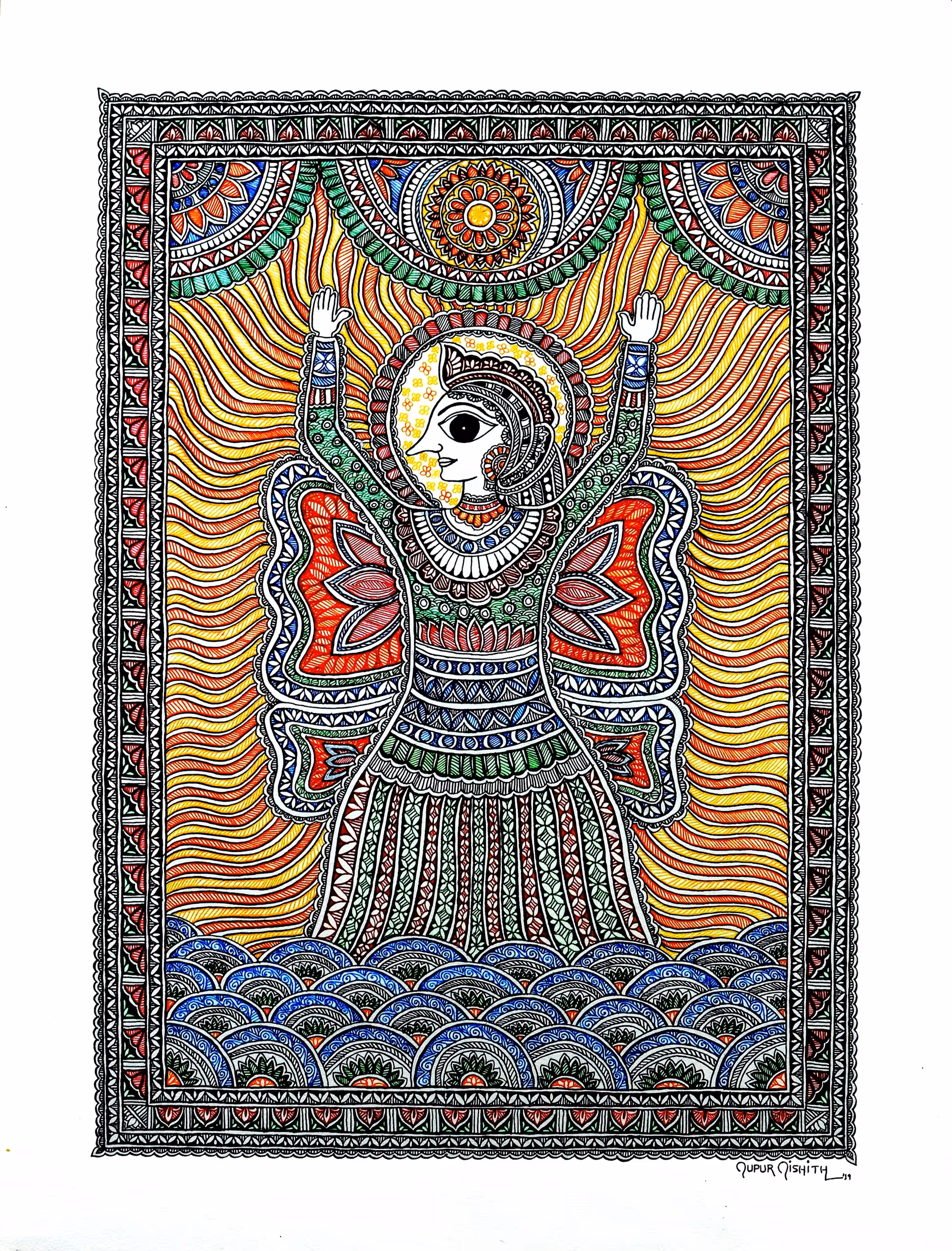
Arohita (Accent)
Nupur Nishith is a USA-based, award-winning artist inspired by Mithila or Madhubani paintings. Roots in Darbhanga-Madhubani, like any Maithil girl, Nupur inherited Mithila Art from her Mother, Dr Mridula Prakash, the first PhD in History of Mithila Painting. She did an MBA and pursued a career in Marketing and Banking with Bank of Baroda. Relocated to the US when her husband was transferred to the New York office in 2011. She rediscovered her art and developed her unique and distinct style in the contemporary art world with a traditional art form, using varied themes and tools. Works on various surfaces ranging from Paper, Canvas, Glass, Clay, Ceramic, Wood, Aluminum, Murals on walls, ceilings, and floors, and installations to Digital tools and software. Her painting Dheeya was awarded by a jury from the Museum of Modern Art (MoMA), NY. Her art has featured in United Nations, Consulate General Of India, NY, Disney family house, Dr Harvey Manes, Nassau County Museum of Art, NY, Asian Art Museum, SFO, CA, Gracie Mansion, New York Mayor Residence, CBS Sunday Morning News, ABC7 News, News12 NY, Huffington Post, Daily California, Indian National Award winning movie Mithila Makhaan among others. With more than 60 exhibitions in the US, she has 8 Solo exhibitions and around 6 Curatorial ventures. Art Ambassador to share dias as a Speaker for Art and Culture of Bihar with Hon. Consulate General of India, NY, and Emmy Nominated Host to some of the internationally acclaimed people, International Mithila Mahila Summit, Nupur is a great advocate of Mithila Art and Culture globally. Nupur actively supports other Artists as one of the leaders in various art organizations, including former Vice President, Pro Arts, the leading art group in New Jersey. She is the founder of Creative Mithila, which intends to promote Mithila Art globally.
I practice art inspired by Mithila or Madhubani folk art from India. I paint on canvas, paper, cloth, wood, ceramic, terracotta, glass, aluminum, along with murals on walls, ceilings, floors, and 3D installations. Even digital paintings for an even wider reach. I have evolved a unique style of art with an amalgamation of traditional motifs of ancient folk art with modern contemporary themes and tools with global appeal.
Mithila Artform is famous for the details in the paintings in a flat two-dimensional perspective with no shading or overlapping. Taking it to the next level, I draw inspiration for my art from my experience and surroundings. I visualize objects and situations in perspective to create the symbolic motifs and designs that make my art unique and distinct. Mithila paintings use natural and bright colors with symbolic distinct features, which I never hesitate to experiment with while conserving the essence of the art form. While a set of my paintings is inspired by the colors in the artform, mostly primary colors, the other set is mostly black and white or subtle use of a few colors in line work, also inspired by the artform. Paints range from various contemporary commercial paints to natural vegetable paints used with brush or dip nibs. I like to work mostly freehand without using any stencils or pattern tools on my projects.
I have learned through observation and everyday experiments. During research and production, new areas of interest arise and lead to the next body of work. So, every piece that I create has a story to tell based on the research and its process of development