
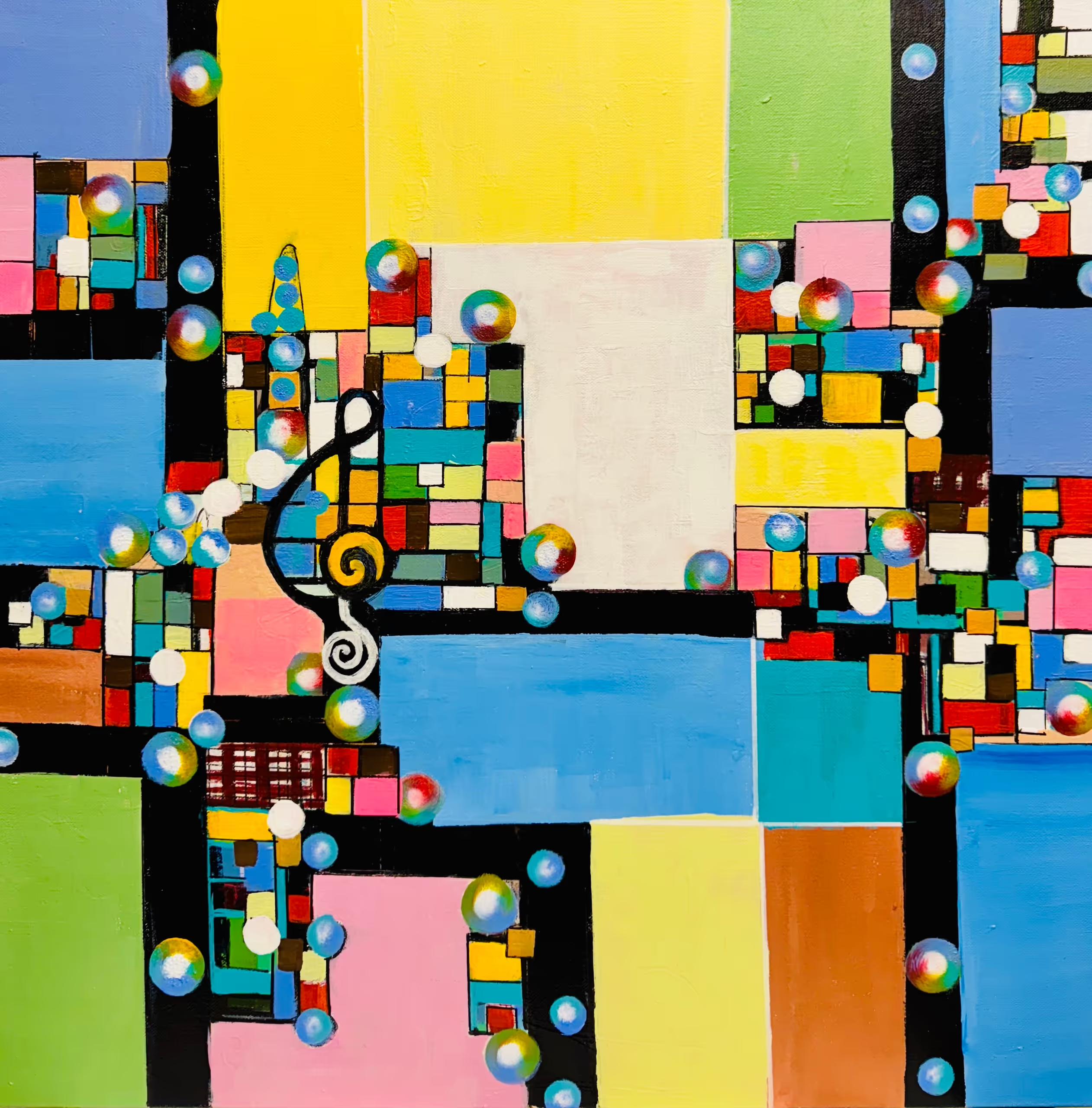
Let The Music Begin
Maries Joseph is a California‑based self‑taught artist whose passion for painting has been reignited following a professional journey in medicine. Inspired by “the unrivalled beauty, perfection, and aesthetics of the Divine Creator,” her work bridges abstract expressionism and nature‑inspired themes.
Today, Maries offers a diverse collection of original artworks in acrylic and oil, as well as premium canvas prints—each designed to bring hope, energy, and spaciousness into daily life. Her pieces range from immersive abstracts like Whispers of the Deep and Celestial Awakening to dynamic nature compositions such as The Kingfisher and Black Horse.
Maries believes art should not just be observed—it should be felt. It’s an experience that invites viewers to pause, reflect, and connect. Her work is perfect for collectors or anyone searching to transform a room with color, emotion, and divine resonance.
Art, for me, is a language of the soul—a way to express the emotions, energies, and divine beauty that often transcend words. My work draws inspiration from the natural world, the cosmos, and the quiet spiritual rhythms of life. Through vibrant color palettes, layered textures, and intuitive mark-making, I aim to create abstract compositions that evoke feeling, reflection, and connection.
As a self-taught artist and a former physician, I bring to my practice a deep sensitivity to the human experience—its fragility, resilience, and mystery. Each painting is a journey of discovery, guided by a reverence for light, movement, and the sacred interplay between chaos and harmony.
I believe art has the power to transform spaces and stir the heart. Whether it hangs in a home, gallery, or office, I hope my work brings a sense of clarity, warmth, and inspiration—an invitation to pause, breathe, and reconnect with what truly matters.
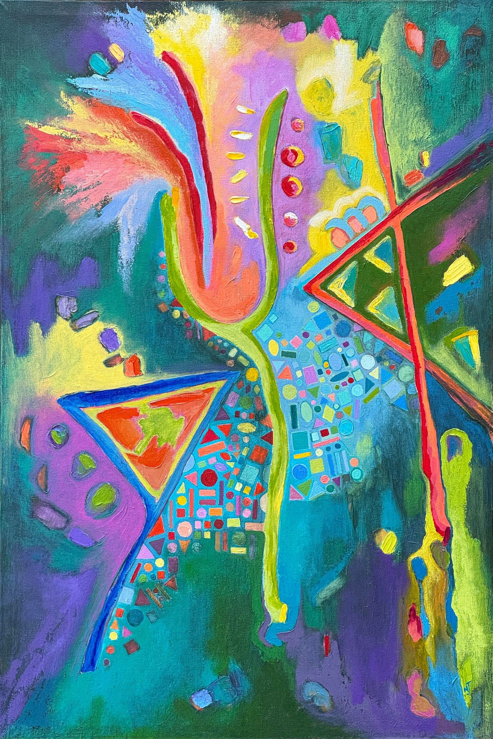
Let There Be Light
Marla Jean Clinesmith is a Louisiana-based painter whose work engages the visual and conceptual depth of the ancient Paleo Hebrew pictographic language within a contemporary abstract framework. Her practice examines how early symbolic systems functioned as both image and language — carrying layered meaning through form, structure, and gesture.
Working primarily in acrylic and often incorporating metallic elements, Clinesmith constructs luminous fields of color that serve as both atmosphere and architecture. Ancient letterforms emerge within these layered surfaces, not as illustration, but as structural components that inform composition, tension, and visual rhythm. Her work explores how symbolic language continues to shape perception and spiritual imagination across time.
A two-time recipient of the Denis Diderot Grant for residency at Château Orquevaux in France, Clinesmith also has four paintings in the Château’s permanent collection. Her paintings have been included in regional and national juried exhibitions, including the Adonai Global Art Fund Exhibition, where she was awarded First Place.
Through an ongoing studio practice, Clinesmith continues to investigate the intersection of abstraction, language, and sacred text — creating paintings that invite contemplative engagement while remaining grounded in contemporary painterly concerns.
Creativity rarely emerges in isolation; it is shaped by the influences that quietly form an artist’s way of seeing. My work is profoundly informed by a sustained engagement with the Ancient Hebrew—Paleo Hebrew—pictographic language, a visual system in which each letter functions not merely as text but as image, gesture, and bearer of layered meaning.
These primordial forms offer more than historical intrigue; they preserve a mode of thought in which language and symbol were inseparable. I am drawn to their ability to communicate complex spiritual ideas with striking visual economy, allowing ancient perception to speak into contemporary space.
Biblical texts remain a steady influence in my work, especially those that speak of God’s presence within human life. The ancient pictographs deepen my understanding of these themes, revealing layers of meaning that shape how I build each painting. I do not aim to illustrate scripture, but to express its depth and mystery through the painting itself.
Working primarily in acrylic and frequently incorporating gold leaf or metallic elements, I build layered fields of color that serve as both atmosphere and architecture. Color remains central to my process — a sensibility first awakened through formal study of color theory and continually refined in the studio.
By uniting luminous color with sacred pictographs, I seek to create paintings that operate as contemplative spaces — places where ancient consciousness and contemporary experience meet, inviting viewers into reflection rather than conclusion.

Let Your Voice Be Heard
Toti Cuesta is an award-winning watercolor artist who creates stunning portraits inspired by nature. Through her work, she hopes to bring awareness to the importance of environmental conservation and share the beauty and peace she finds in the natural world. With her profound love for mother nature, Toti Cuesta’s pieces are a must-see for anyone looking to connect with the environment.
After years of working in the international arena as a lawyer, she decided to pursue her great passion – art – and live a meaningful life. Art has always had a healing power for Toti, and she trained as an Art Therapist to help others heal with art.
Toti strives to create pieces that connect the viewer to the subtle worlds of the universe. Through her art, she invites her viewers to partake in a magical and transforming experience by combining several planes of reality. Her pieces seem connected to an infinite flow of energy. Toti Cuesta’s work is a tribute to the beauty and power of nature, and it is a reminder of the deep connection between us and the world we inhabit.
Toti Cuesta has created a remarkable portfolio of beautiful watercolor portrait art that reflects her deep love and admiration for nature. Her work has earned her recognition and international awards, as well as exhibitions in places such as New York, Venice, and Zurich. Her art has also been featured in several international books and magazines, including ArtTour International magazine’s TOP 60 Masters list.
Toti’s pieces are not only captivating to look at but also serve to bring awareness to the importance of environmental conservation. Through her vibrant and dynamic portraits, Toti can show the peace and beauty found in nature if we take the time to appreciate it.
As a surreal portrait artist, I use watercolor to create paintings that merge symbols and vibrant colors, inviting you into a new world filled with light and life. Through these elements, I communicate universal stories that resonate within your subconscious, connecting you with the divine and the eternal. My art offers an alternative view of the world that inspires you to explore more profound levels of consciousness and rediscover human divinity.
The female figure, central in my works, symbolizes life, maternity, creativity, resilience, and love. She represents Mother Earth, embodying love and respect for everything around us, including nature and the urban environment, which deserve our care to create a more loving and just world.
My colors convey energy and emotion, utilizing a mix of cool and warm tones to symbolize the connection between heaven and earth. They evoke emotions and reflect the human experience. The eyes symbolize our window to the world and the ability to perceive truths beyond the visible.
Through my series of paintings on “urban art,” I seek to share inspirational phrases that invite reflection and connect us with our true essence, reminding us of the immense potential we all carry within.
Through my art, I aim to capture the beauty of the universe and the human experience, prompting reflection on our interaction with the environment and the importance of preserving the natural and cultural beauty surrounding us.

Light
Amy Lewis is a self-taught artist from Washington state. Her watercolor and oil paintings are vivid lifelike snapshots of ordinary life glamorized. Amy, inspired by fashion editorials and historic paintings of aristocracy, pairs everyday objects with rich backgrounds. The juxtaposition of the ordinary and the luxurious sparks an appreciation for the things we take for granted. She paints to cultivate joy and an appreciation for the beauty that is all around us.
My work is a practice of gratitude. It is the cultivation of joy and an appreciation for the beauty that is all around us. I’m constantly exploring ways to portray ordinary life as glamorous. Everyday objects with luxurious backgrounds create a juxtaposition that sparks an appreciation for the things we take for granted. In the beauty of the ordinary, I am reminded to be grateful and to use my privileges for the good of others. Fashion editorials and historic paintings of aristocracy are rich sources of inspiration. I work in watercolor and oil paints. For watercolors and oil paintings, alike, I paint roughly 3-4 layers. Many layers mean that the resulting painting has a smooth finish and vivid complex colors. Depending on the size, medium, and complexity of a piece they can take 1-2 days or 1-2 months. Most recently I am proud of being featured in Gita Joshi’s Art Seen Magazine and throwing my own group art exhibition in Seattle, WA.

Light At The Gates Of Darkness
Born and raised in the tough Italian neighborhood of Ducktown, Atlantic City, NJ, John Calabrese currently resides in Denton, Texas with his wife Margaret. He received his BA in Art from Catholic University, Washington, D. C., MFA in painting from Pratt Institute and his PhD in Comparative Arts from Ohio University.
He is Professor Emeritus of art at Texas Woman’s University where he taught art history, aesthetics, history of film noir, the art of Alfred Hitchcock, and was in charge of the studies abroad art history program which he initiated in 1994. He has published articles on Paul Klee, J. R. R. Tolkien’s “Lord of the Rings,” and Alfred Hitchcock’s “Vertigo” and “The Trouble with Harry.”
He has painted the boxer Joe Frazier and drawn portraits of Frank Sinatra and Mickey Mantle. He had coffee with Joe DiMaggio and is a lifelong Yankees fan.
His work has been exhibited in numerous national juried exhibits among which are: “Wanderlust” Art Fluent Online Gallery, MA; “Intergalactic Open” Shock Boxx Gallery, Hermosa Beach, CA; 14th Annual Contemporary International Drawing Discourse, Univ. of NC, Ashville; 28th Arts North International, Hopkins Center for the Arts, Hopkins, MN; and the upcoming CAL International, Conroe Art League, Conroe, TX and another “Wanderlust” Webster Arts Gallery, Webster Groves, MO.
Delicate nuance of value and texture become tools in conveying powerful dramatic statements about earthly beings who are not afraid to wonder, think, dream, and take that one step beyond.
The inhabitants of the cosmic atmosphere appear at odds with their surroundings, (many of which are actually specifically named astronomical objects). This is the result when the merely earthly confronts its unavoidable connection to the awe, mystery, and majesty of the heavens.
However, when fragile earthly beauty confronts sublime heavenly beauty, the earthly is reverently and silently humbled.
I would like to dedicate this exhibit to the memory of my dear friends Chris, Desi, and Franco.
I greatly appreciate HMVC Gallery New York for this opportunity to showcase my drawings.

Lil Nas X
When I was in grade school and high school, I did a lot of art. I like to think it offered me an incredible foundation for what would come much later. In high school, I studied under Walt Bartman, doing oil painting primarily. I was accepted into the Maryland College of Art and Design on a figure drawing scholarship program that they offered to high school students when I was 16. After high school, I went on to pursue my other passion — helping people. I’ve spent the last 25 years working as a psychotherapist. Sometime in the middle of all of that, I had kids (twins), and eventually came back to drawing in 2017. What I do now is primarily self-taught, though I do feel my training and education as a child have created an invaluable foundation for my work today. I’ve watched countless hours of slowed-down YouTube videos and tutorials, and have spent thousands of hours drawing, practicing, and improving. It’s been a wonderful and challenging journey, and I’ve loved every minute of it! My goal moving forward is to continue to learn and challenge myself as I transition to art full-time. I feel the next step is to get my name out there to the art world. I have just recently started applying to calls via café, and have been accepted into a small handful of international juried shows. My goal as an artist is the same as my goal as a human — connection. I work to find the place where we all meet; that place where our differences recede, and we can settle in. That’s why I draw, to find that snapshot moment where someone can look at my art and go, Oh, yes. I know that feeling.
My artistic practice centers on portraiture—on drawing out the unseen essence of a subject and translating it through the delicate control of graphite. I explore the quiet power of detail—each mark is an invitation to slow down, to look closer, and to witness what is often overlooked. Every drawing is a form of deep listening, an act of attention that honors the emotional and psychological presence of the individual.
I believe hyperrealism, when pursued with discipline and sensitivity, becomes more than a replication of the visible world—it becomes a mirror, a bridge, and sometimes, a wound made visible. I’m fascinated by the complexity of the human face and the subtle interplay of light, texture, and expression that gives a portrait its emotional charge. As a psychotherapist, I’m naturally attuned to nuance, which shapes my artistic philosophy: that realism can reveal as much about the internal world as the external one. It allows me to build tonal depth slowly, almost sculpturally, honoring the patience, presence, and attention each subject deserves.
My style has evolved over the last eight years to a refined form of realism that balances technical control with expressive intent. I see art as a language, and my goal is to create a sense of atmosphere and feeling. I’m currently exploring new directions, including the integration of charcoal for its expressive depth and contrast.
My goal as an artist is the same as my goal as a human — connection. I work to find the place where we all meet; that place where our differences recede, and we can settle in. That’s why I draw, to find that snapshot moment where someone can look at my art and go, Oh, yes. I know that feeling.
My artistic practice centers on portraiture—on drawing out the unseen essence of a subject and translating it through the delicate control of graphite. I explore the quiet power of detail—each mark is an invitation to slow down, to look closer, and to witness what is often overlooked. Every drawing is a form of deep listening, an act of attention that honors the emotional and psychological presence of the individual.
I believe hyperrealism, when pursued with discipline and sensitivity, becomes more than a replication of the visible world—it becomes a mirror, a bridge, and sometimes, a wound made visible. I’m fascinated by the complexity of the human face and the subtle interplay of light, texture, and expression that gives a portrait its emotional charge. As a psychotherapist, I’m naturally attuned to nuance, which shapes my artistic philosophy: that realism can reveal as much about the internal world as the external one. It allows me to build tonal depth slowly, almost sculpturally, honoring the patience, presence, and attention each subject deserves.
My style has evolved over the last eight years to a refined form of realism that balances technical control with expressive intent. I see art as a language, and my goal is to create a sense of atmosphere and feeling. I’m currently exploring new directions, including the integration of charcoal for its expressive depth and contrast. I’ve just completed my largest piece to date—a graphite portrait measuring three feet tall and two feet wide—which has expanded both my physical and emotional engagement with the medium, allowing space for story, intimacy, and connection.
My goal is to create drawings that don’t simply replicate life but evoke it—quietly, powerfully, and with honesty.
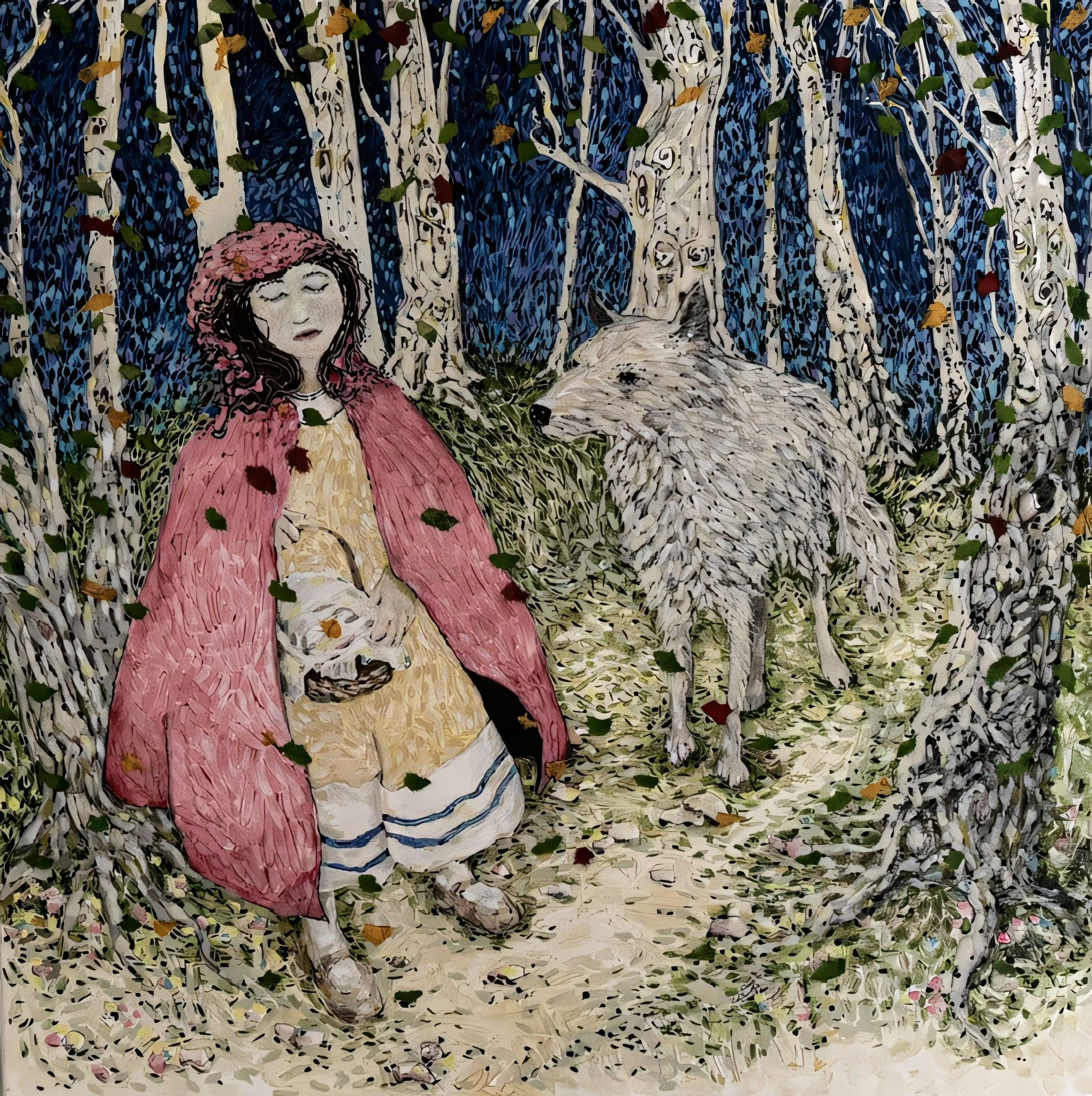
Lil Red
Leombruni is a Connecticut-based painter whose work explores the emotional and psychological dimensions of human experience through a lens of expressive realism. Janet Leombruni is President Emeritus of CT Women Artists. She is an Elected Member of the CT Academy of Fine Art, New Haven Paint &Clay, West Hartford Art League, and her work is part of multiple collections in the US and Europe.
Solo shows: Celeste LeWitt Gallery at UCONN Health Center, Arts of Tolland CT, the Monastery Gallery in West Hartford, Atrium Gallery at Raymond Library EH CT, FIAT LUXE at the Art League of New Britain, Workspace Manchester, CT. Leombruni has held artist talks at Kehler-Liddell Gallery in New Haven and the Mattatuck Museum in Waterbury, and was a featured artist for the CWA Art Chat Series. Her work is currently in the Hillstead Museum, Farmington, CT.
Group Shows: Jorgensen Gallery, UCONN, Mattatuck Museum Waterbury, Monastery Gallery, West Hartford, Slater Memorial Museum, CT, Barnes-Franklin Gallery Tunxis, CT, Flinn Gallery with the Greenwich Art Society, Theaterworks, Hartford, CT, CAFA at Lyme Academy of the Arts and Sill Gallery, Old Lyme, the New Britain Museum of American Art, New Haven Paint and Clay, SOHO20 Chelsea, NYC, KBM Gallery Riverside, CA, Rhode Island Watercolor Society, San Fernando, CA, dodomu Gallery, Brooklyn, NY, and San Rafael, CA.
Leombruni received a BA from Hartford Art School, an MA in Education from UCONN, and a Master Plus 30 in Painting and Art Education from CCSU.
In my work, I tell the stories of my experiences in the classroom. I also explore relationships, sometimes utilizing tropes or idioms in the form of children’s literature, myths, films, or portray stories as told to me by my students. I like to examine themes of hope, impulsivity, family, fantasy, innocence, and coming of age. My colors are powerful. Figures often occupy charged, ambiguous spaces, where gesture, symbolism, and narrative intersect to reveal underlying tensions between individuals and their environments. I seek to draw the viewer in, to elicit an emotional response. I like to ask the viewer to determine: What is really going on here?

Lilies Of The Nile With Pink Ladies
Steve Walag has been a photographer for nearly 50 years. He earned a Bachelor’s degree in English and Religious Studies from the University of California, Riverside (UCR) and a BFA in Photography from Art Center College of Design in Pasadena, California. He has enjoyed a varied career as a photojournalist, public relations photographer, freelance architectural shooter, photo instructor, and campus photographer at Inland area schools (UCR and Riverside City College). All the while, Steve has pursued his artistic path on the side, beginning decades ago with a strong affinity for the black and white photography of the West Coast “straight” photo school. It is only since 2015 that his attraction to Japanese art led him to formulate the style shown here.
Although Steve’s images may resemble paintings, they are in fact digital photographs printed on textured paper. They were inspired by traditional Japanese paintings in the centuries-old Rinpa tradition. Rinpa artists favored simple, natural subjects – flowers, trees, birds, and landscapes – set against a plain or minimized background. Steve’s fascination with Japanese art led him to emulate those works using digital imaging, lighting, software, and printing techniques.

Lilies Of The Nile With Rain
Steve Walag has been a photographer for nearly 50 years. He earned a Bachelor’s degree in English and Religious Studies from the University of California, Riverside (UCR) and a BFA in Photography from Art Center College of Design in Pasadena, California. He has enjoyed a varied career as a photojournalist, public relations photographer, freelance architectural shooter, photo instructor, and campus photographer at Inland area schools (UCR and Riverside City College). All the while, Steve has pursued his artistic path on the side, beginning decades ago with a strong affinity for the black and white photography of the West Coast “straight” photo school. It is only since 2015 that his attraction to Japanese art led him to formulate the style shown here.
Although Steve’s images may resemble paintings, they are in fact digital photographs printed on textured paper. They were inspired by traditional Japanese paintings in the centuries-old Rinpa tradition. Rinpa artists favored simple, natural subjects – flowers, trees, birds, and landscapes – set against a plain or minimized background. Steve’s fascination with Japanese art led him to emulate those works using digital imaging, lighting, software, and printing techniques.