

Curve
Kylo-Patrick Hart is an award-winning photographer and chair of the Department of Film, Television, and Digital Media at Texas Christian University (Fort Worth, Texas, USA). He received his formal training in digital media arts while a student at the University of Michigan and Wayne State University, with additional instruction provided by offerings of the Maine Media Workshops and Santa Fe Workshops. His photographs have been exhibited in numerous cities throughout the United States and in several countries abroad.
Photography has been my passion since early childhood. My motivation is to discover and capture the beauty, even when it is not always readily self-evident, that surrounds us continuously in all areas of our everyday lives. I believe the finest images are those that are serious yet playful, aesthetically appealing yet a bit quirky. As both an artist and an admirer, my favorite photographs tend to be ones whose contents speak loudly for themselves — even when it is not immediately clear exactly what they are saying.
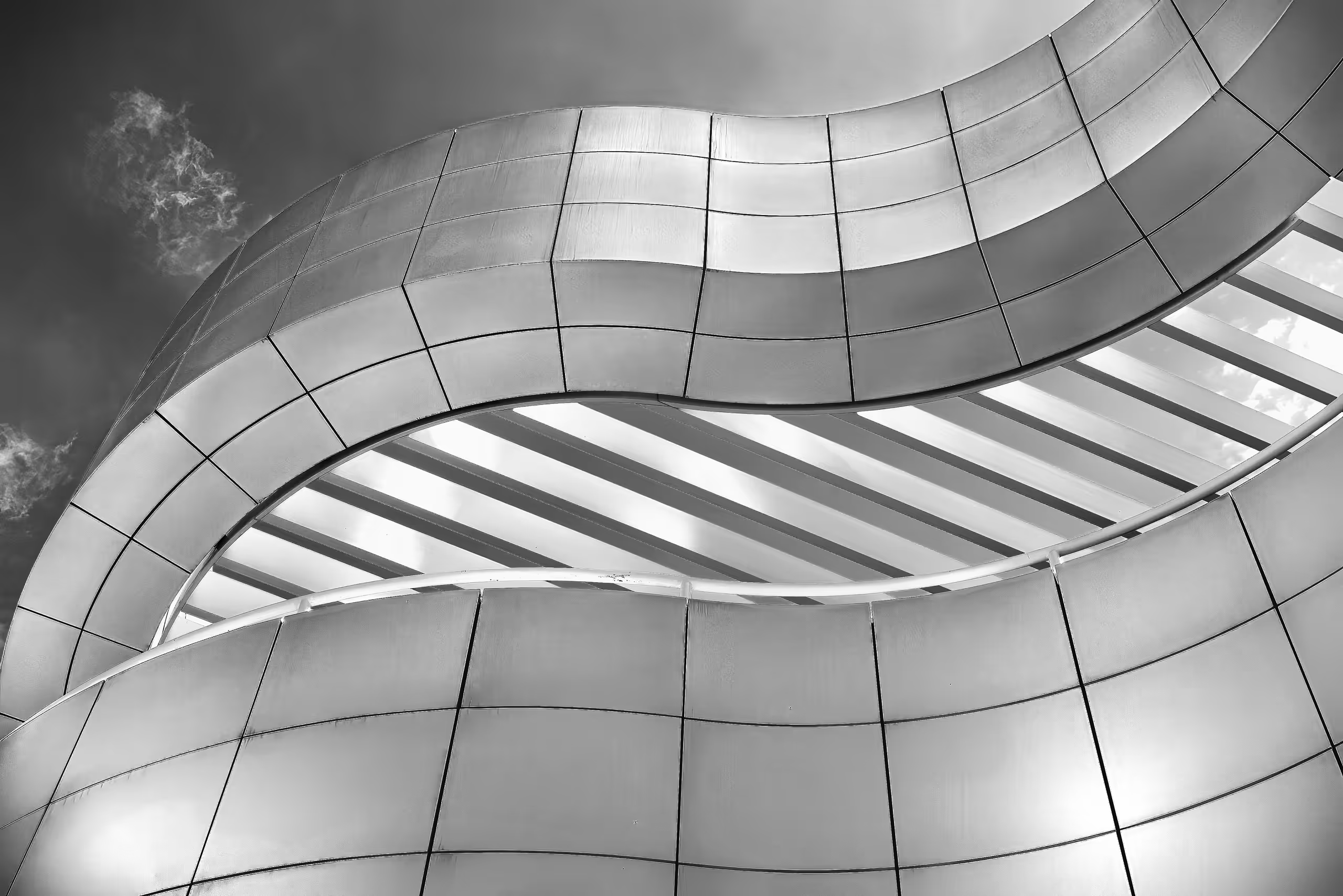
Curved Elegance
Raffi Bashlian’s photography beautifully weaves together themes of resilience and the complexity of human experiences. With a rich cultural background from cities like San Francisco, London, New York, and now Paris, Raffi infuses his art with a global perspective. His dual roles as a clinician and researcher lend depth to his visual narratives, allowing him to capture emotional nuances with scientific precision. The stark contrasts he observed during Lebanon’s civil war—where destruction meets renewal—serve as a powerful backdrop for his storytelling.
Through his lens, Raffi reveals the hidden beauty in everyday life, encouraging viewers to appreciate both the simplicity and intricacies of existence. Each image he captures symbolizes survival and transformation, inspiring hope and resilience in those who engage with his work. His art transcends traditional photography, creating an immersive tapestry of cultural narratives that foster connection and reflection, celebrating the essence of life and the extraordinary stories within ordinary moments.
Raffi’s award-winning portfolio spans diverse genres, ignited by a transformative safari experience in Africa in 2013. From the majesty of wildlife to urban architecture and vibrant street scenes, his keen eye captures unique moments that tell compelling stories. His understanding of composition, timing, and gesture reveals a passion for symmetry and balance, whether in striking black and white or vibrant colors. For Raffi, photography is not just about capturing images; it’s about seeing the world through a fresh lens and expressing his artistic voice. Each photograph reflects his commitment to uncovering the beauty and complexity of everyday life, inviting us to discover hidden treasures in the most unexpected places.
In the “Where Worlds Meet” exhibition, my photographic series explores the dynamic interplay of urban landscapes and the ethereal realms of imagination. I have always been very curious about our wonderful world and what it visually offers. What fascinates me about photography is the ability to start a narrative, while leaving it open for interpretation by the viewer. My work ranges from abstract compositions to simple and straightforward images. When I witness a scene, I strive to visualize it as I experience it, seeking the perfect angle and patiently waiting for the ideal moment and lighting to capture it. This process can be spontaneous or require hours of dedication. Photography not only feeds my imagination but also excites my mind. It takes me to beautiful places, both physically and spiritually. I find it to be a therapeutic and fulfilling art form. I hope you enjoy my work and find your own stories within it.
Through these works, I aim to build bridges across perceived divides, inspiring audiences to embrace the multifaceted nature of connectivity and coexistence. My artistic vision seeks to celebrate the beauty and complexity that emerges when different worlds, identities, and elements meet, intertwine, and coexist within the realm of artistic expression.

Curvy
Wendee Yudis is a Serigraph Mixed Media Artist whose paintings and prints have been exhibited in solo and group shows in galleries in NYC, Chicago, and Philadelphia since the mid-1990s. Solo exhibitions include Ceres Gallery in NYC, Black Moth Gallery in Phila, and Gallery 1633 in Chicago. A selection of group exhibitions includes The Albright/Knox Museum in NY, Manhattan Graphics Center in NYC, Philadelphia Art Alliance in PA, James Oliver Gallery in Phila, PA, University of Pennsylvania: Penn Medicine in PA, CFEVA in PA, InLiquid in PA, DaVinci Art Alliance in PA, and The Trenton Museum in NJ. Select work was in a national juried competition in the Phoenix Gallery in NYC by Thelma Golden, then curator of The Whitney Museum of American Art.
Wendee Yudis received an MFA in Printmaking and Painting from Pratt Institute and a BFA in Printmaking and Photography from The School of the Art Institute of Chicago. She also studied archaeology at The Hebrew University of Jerusalem and photography at Richmond College in London.
In addition to being a visual artist, Wendee works as a Graphic Designer and Art Director. Since the mid-1990s she has worked in agencies and non-profits in NYC and Philadelphia.
My art turns the definition of femininity on its head.
It examines and questions women’s roles in the world as dictated by social constructs: the ones imposed upon us – obedient child, wife, and daughter – and the ones we step into voluntarily – boss, lover, and vixen.
I use humor to explore the depths of these ideas. Womanhood cannot and should not be confined to one definition. Why do we have to be vixens or victims? Can we be both? My work explores the paradox of the powerful vs. the powerless in a manner that is both playful and sexual. The women in my work become icons who reoccur in different contexts and combinations. In this way, my work is layered with meaning. I look at the words we use to define masculinity and femininity and play with typography and context. For example, why is a bossy man synonymous with executive leadership while a bossy woman is a bitch? My bold and graphic treatment of words amplifies my ideas and by questioning the many facets of women, I embrace the freedom and power within every woman.
My primary medium is a combination of photo-silkscreen and painting. Silkscreen allows me to juxtapose and overlap a variety of images to create nuance and explore new definitions of old ideas. I use the actual silkscreen as if it’s a paintbrush, so each piece is an original. The beauty of the silkscreen process is that it allows me to experiment with translucency, opacity, layering, and pattern to explore relationships seen and unseen.

Cutlery
Cher Pruys, ASAA SCA, IGOR, AAPL, CSAA, AMS, LMS, OSA, MAA, CFA, NOAPS, PSOA, AWA., AAOA.
“To take my inner visions with my hands and create a work of art for you the viewer… That is the ultimate in self-expression.”
Cher Pruys was born in Regina. Over the years she lived in many places including Saskatoon, Calgary, Edmonton, Ottawa, and Fort Frances, settling into her present home in Devlin, on the banks of the Rainy River with her husband Mark, 4 dogs, and 2 cats.
By age three, Cher was seldom found without a drawing tool in hand. She worked in pencil, charcoal, and ink over the years, until, she picked up a paintbrush at the age of 35. Beginning with oil paints, she found her chosen mediums in acrylic, watercolor, and gouache.
Although self-taught, her dedication and talent have seen her work juried into 463 International exhibits, as well as exhibits in numerous non-juried shows. She has won 718 awards for her work in the International Juried Exhibits.
Her work has graced the covers of 3 books, and 36 magazines, including The Best Of Acrylic Fall 2021, the cover of the May 2022 Arabella Magazine, #20 Hyperrealism Magazine with “Girls Girls Girls”, & #21 with “The Young Cowboy”, & the latest, Artists & Illustrators March 2024. She has been featured in over 350 International publications. Cher’s works have found a permanent home in private and public collections worldwide.
I am a self-taught artist working in water-based mediums, mainly acrylic, but also at times gouache and watercolor. I am a hyperrealism painter fascinated by the world around me. I am very drawn to shiny surfaces as well as transparent objects, especially when the lighting brings them to life. I look for beauty in everyday objects that most people take for granted or just don’t truly see as they are. The seemingly boring and mundane subjects can truly be like magnets if portrayed in the right light. The shiny metal is one of those materials that can host endless visions….the light hits it and the reflections are captured on the smooth, sleek surface…people and animals especially the eyes…an artist’s dream! My future art plans are to paint the countless subjects I have chosen to become paintings and to share my art with as many people as I can.
“To take my inner visions with my hands and create a work of art for you the viewer… That is the ultimate in self-expression.”

Cyclone
Subodh Maheshwari was born in Aligarh, Uttar Pradesh, North India where she learned folk art and classical music. She passionately believes: “In the threshold of my life, my present is the window to the past and a key to the future”. She acquired her degrees and studied art at Agra University, California State University of Fullerton, and the University of California Irvine. Subodh has won numerous awards, including the Regional Fellowship Award at UCI in 1986, the Bharat Gaurav Award in India in 2015, and the 60 Masters Award in 2017, 2018, and 2019. She is also registered in Marquis’ “Who’s Who in America”, the standard in biographical information. Her paintings have also won awards in a variety of categories including landscape, open, all women, nature, elements, seasons, and abstract.
Subodh is a diversified artist who enjoys telling stories through her artwork, whether it is through landscape, flowers, or abstract art. Her art is a fusion of Eastern symbolism and Western composition, influenced by 16th and 17th century Rajasthani and Mogul art, and accented by poetry, passages, and phrases in Hindi, Sanskrit, and English. She admires Georgia O’Keeffe for her floral influence, and Frida Kahlo for her courage. Whether it is the serene beauty of nature, her spirituality, or the current political climate, she finds inspiration. Having a life shared between India and America, she sees the beautiful similarities, like love which transcends all borders. Highly individual in her style, her works are described as emotional, mysterious, personal, spiritual, and humorous.

D Train
Ronaldo Byrd was born and raised in Brooklyn, New York. He is a Contemporary Hip “Pop” Artist who began painting at the tender age of 3. As an early teen, Byrd was accepted to and attended Art Instruction School, which boasts graduate, Charles Schulz. He graduated and received a Diploma in Art from Art Instruction School at age 16. While enrolled in the course, Byrd was also attending The High School of Art and Design in New York City, before moving to Burlington, New Jersey. Byrd then was accepted to and attended Burlington County Institute of Technology, where he majored in and received a Diploma in the field of Advertising Art and Design. Byrd is mostly a self-taught Artist who has developed his own style of art and his own characters, which he puts in phenomenal scenes. He has shown his work in several galleries, including a solo show at Michigan Medicine in Ann Arbor, Michigan. Byrd and his artwork have also been featured in several newspapers and magazines. One of which includes, The Philadelphia Inquirer. He has also been a feature story on CBS 3 Eyewitness News. Byrd’s message to the world through his artwork is one of love and acceptance. His hope is to convey this as boldly and as beautifully as he can.
I am a Contemporary Hip “Pop” Artist who just happens to be on the Autistic Spectrum. My artwork focuses on the fact that everyone is beautiful regardless of race, color, ethnicity, gender or sexual orientation. The bold colors I use represent the way I see the world. There is beauty in everything I see and I believe that everyone has something to offer to the world in their own special and unique way. Thus, I have been deemed “The Artist of Happiness” because of the joy that my artwork brings to countless people. My art and I represent differences and my hope and goal is for the entire world to be able to see beauty and acceptance through my eyes—-the eyes of an artist.

Daisy Dreamer
Heini Mika is a Finnish artist who works and resides in New York City. Heini has a BA degree in Fine Arts from the University of Worcester (UK) and a Fine Art and Visual Communications degree from the Pekka Halonen Academy of Art (Finland). She has exhibited her paintings worldwide, most notably in The United Kingdom, United Arab Emirates, Indonesia, and New York. Her paintings have been published in a variety of magazines including the British Vogue and some of her artworks are held by private collectors.
Heini’s contemporary paintings serve the viewer with a palette of vibrant colors and dynamic shapes while she gives you her unique perspective on women, fairytales, and history. They have been an essential source of inspiration for Heini throughout her career as an artist and this can be observed in her rich and intriguing original artworks. Heini Mika is also the co-founder and chief curator at her own online art gallery the HMVC Gallery New York.
For the longest time, women have always been the subject of great art, but rarely were we allowed to create great art. Being a female artist in the 21st Century, I look to my female heroes for guidance and inspiration. From Marie Antoinette to Miley Cyrus I paint my subjects the way I see them, inspiring, beautiful, and most importantly, complex. There is so much more to these women than meets the eye, yet all of them were or are dismissed at face value.
In my acrylic paintings, I explore the dichotomy between my female subjects and their personal stories. While my almost cartoonish art style may play into the notion that these women are ditzy and childish, my intention is to tell their true stories. These women have inspired me, and while I wish to emulate their pop culture selves, I am aware of the darkness that lurks behind the fun. To convey this darkness I like to paint moments from their lives that don’t play into the notion of fun and positivity. I chose to work with acrylics because as a medium they are as bright as an artist’s medium gets. This naturally plays into my exploration of my subject’s pop culture image. It’s fun and colorful, yet if you look twice, there’s still the true story behind my fun image.
My painting style is dynamic, colorful, and intriguing and with that, I want to invite the viewer to look at the women I admire. And to remind everyone that when it comes to women, there is so much more than meets the eye.

Dance Of The Vines
Joanne M. Meurer is the creative director and founder of ReInvent Strategies, Inc., a boutique marketing and branding firm located in NYC. She brings over two decades of corporate branding and strategic marketing expertise to New York City’s entrepreneurial landscape. As Creative Director, she ensures businesses authentically represent themselves in print and online, fostering their unique identity.
Joanne’s impact extends beyond marketing; her Acrylic Mixed Media works have been displayed at several galleries across NYC and Brooklyn, solidifying her presence in the artistic community.
Joanne’s commitment to the arts is evident through her involvement with BWAC and “Art on The Terrace,” which demonstrate her dedication to fostering artistic expression. Currently represented by NYC Arts Empire, her artwork has been displayed on the NASDAQ Billboard in Times Square, Big Screen Plaza in Midtown Manhattan, and several KIOSK throughout NYC, further underscoring her significance in both the marketing and art spheres.
I am Joanne Meurer, an artist who thrives on the interplay of mood, music, and materiality. My creative journey is a fusion of passion and precision, where the rhythms of rock and jazz-funk electrify my canvas, igniting a symphony of color and texture.
As a graphic designer by trade, my work is defined by meticulous detail and deliberate composition. Yet, beneath the surface lies a wild spontaneity—an untamed energy that pulses with the complex cadences of electric guitar solos and soulful jazz melodies.
Music is my muse, infusing each piece with an ethereal vitality that transcends the ordinary.
Whether inspired by the pulsating beats of global events or the intimate whispers of my innermost thoughts, my art reflects the world as seen through the lens of my consciousness.
Exploring beyond the confines of traditional art, I embrace the challenge of sculpting three-dimensional forms that mirror the depth of my personality and aspirations. Like a master craftsman, I mold form and substance into expressions of dimensionality, inviting viewers to journey beyond the surface and uncover the hidden layers beneath.
When you encounter my work, what may initially appear as a distant tableau soon reveals itself as a vibrant tapestry of complexity and nuance. With each brushstroke and every note, I invite you to delve deeper into the kaleidoscope of my soul—a realm where light and shadow dance in harmony, where chaos and order merge to form a symphony of expression.
In every moment, in every creation, I rediscover myself—a seeker, a storyteller, a dreamer of boundless possibilities. Through my art, I invite you to join me on this timeless voyage of discovery, where the journey is as infinite as the creative spirit itself.
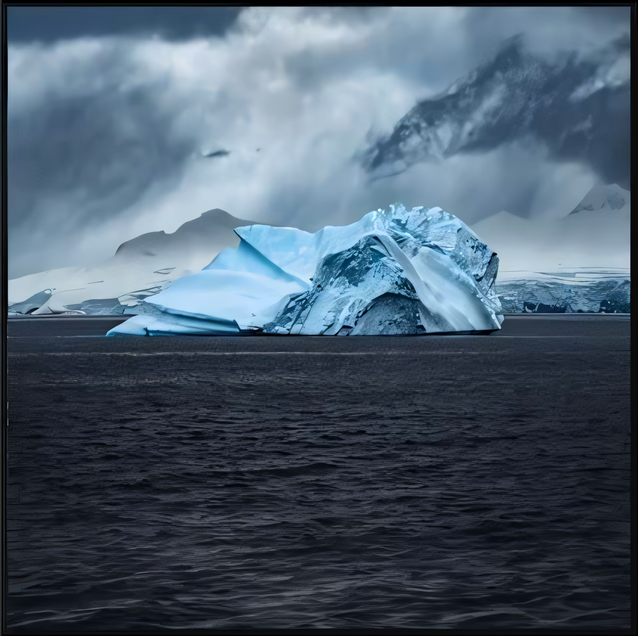
Danco Coast
Mital Patel is a fine art photographer whose work explores the relationship between form, minimalism, and emotional presence in natural environments. His imagery often focuses on isolating subjects within vast landscapes, using light, scale, and restraint to create a sense of stillness and contemplation.
Working across wildlife and remote environments, Patel’s recent work has shifted toward more minimal and conceptual interpretations of nature, where composition and tonal control play a central role.
His work has been exhibited and recognized internationally, with a growing focus on fine art presentation and gallery-based storytelling.
Ice exists in a narrow spectrum of tone, where color is restrained, and form becomes the primary language. In this body of work, I explore the Arctic as a study in subtle variation shifts in light, texture, and scale within a limited palette.
Each image isolates a different presence: dominance, stillness, and quiet transience. The restrained blues and greys are not just aesthetic choices, but a way to remove distraction and focus attention on structure and atmosphere.
By working within a singular color space, the landscape becomes less about place and more about perception, where form, silence, and scale begin to dissolve into something introspective.