

Calandrinia At Dusk
Steve Walag has been a photographer for nearly 50 years. He earned a Bachelor’s degree in English and Religious Studies from the University of California, Riverside (UCR) and a BFA in Photography from Art Center College of Design in Pasadena, California. He has enjoyed a varied career as a photojournalist, public relations photographer, freelance architectural shooter, photo instructor, and campus photographer at Inland area schools (UCR and Riverside City College). All the while, Steve has pursued his artistic path on the side, beginning decades ago with a strong affinity for the black and white photography of the West Coast “straight” photo school. It is only since 2015 that his attraction to Japanese art led him to formulate the style shown here.
Although Steve’s images may resemble paintings, they are in fact digital photographs printed on textured paper. They were inspired by traditional Japanese paintings in the centuries-old Rinpa tradition. Rinpa artists favored simple, natural subjects – flowers, trees, birds, and landscapes – set against a plain or minimized background. Steve’s fascination with Japanese art led him to emulate those works using digital imaging, lighting, software, and printing techniques.

Calandrinia Flowers
Steve Walag has been a photographer for nearly 50 years. He earned a Bachelor’s degree in English and Religious Studies from the University of California, Riverside (UCR) and a BFA in Photography from Art Center College of Design in Pasadena, California. He has enjoyed a varied career as a photojournalist, public relations photographer, freelance architectural shooter, photo instructor, and campus photographer at Inland area schools (UCR and Riverside City College). All the while, Steve has pursued his artistic path on the side, beginning decades ago with a strong affinity for the black and white photography of the West Coast “straight” photo school. It is only since 2015 that his attraction to Japanese art led him to formulate the style shown here.
Although Steve’s images may resemble paintings, they are in fact digital photographs printed on textured paper. They were inspired by traditional Japanese paintings in the centuries-old Rinpa tradition. Rinpa artists favored simple, natural subjects – flowers, trees, birds, and landscapes – set against a plain or minimized background. Steve’s fascination with Japanese art led him to emulate those works using digital imaging, lighting, software, and printing techniques.
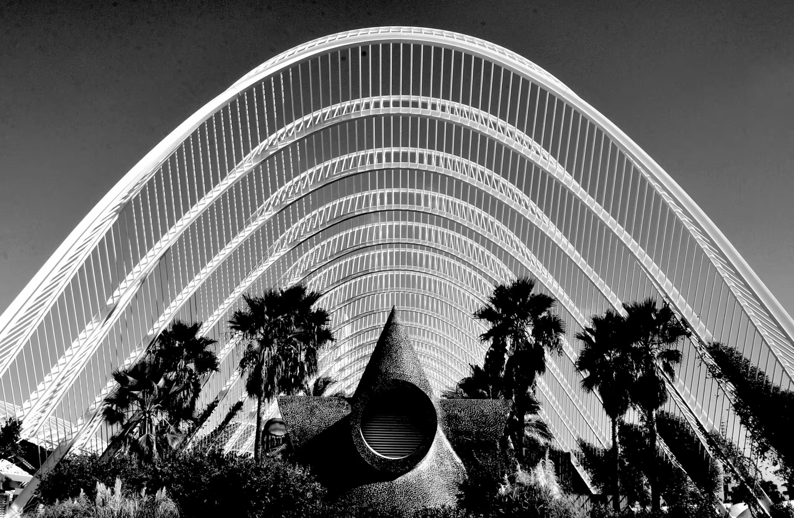
Calatrava’s Valencia
Karen Safer is an international, award-winning photographic artist and poet with a musical bent. A Los Angeles native, born to creative, scholarly-minded parents who encouraged her world travel (230+ countries/territories visited).
Early on, she was greatly influenced by movies, music, books, and plays, and as a student of art and history, inspired by ancients to moderns – Assyria to Cindy Sherman. She has a bachelor’s/master’s degree in Art from UCLA and California State University. She is a member of the Los Angeles Art Association, IAA-USA, Women United, Praxis Gallery, LACMA, MOCA, IAA-USA, in Who’s Who of Professional Women, ArtTour Magazine (NY), AATOLAU interview, Artist Talk Magazine (UK), Lens Magazine, etc. She was given a camera and crayons at 3 and exposed to/inspired by California motifs: light, trees, the ocean, music, and vernacular architecture that defined/influenced her left-handed aesthetic. She began taking pictures of family and friends, progressing from painting to developing black-and-white photos in college. She was fortunate to begin a life of travel as a teen that shaped her love of the exotic paired with an eye for the formal, accidental, and unusual while subliminally seeking the “beautiful” that jiggles the lens/frame of my eye.
She is featured in magazines, catalogs, and books and exhibited internationally in over 80+ galleries/museums with over 370+ exhibitions from London, Rome, Berlin, Glasgow, Budapest, Athens, Prague, Paris, Barcelona, Florence, Venice, Sao Paulo, from California to New York, winning 360+ First and other awards – most recently: Black & White SPIDER Awards nominee, 21st Julia Margaret Cameron Awards in Abstract and in Architecture categories, Botticelli International Prize in Florence, LA Art Show 2024, 17th Annual Color Awards and soon in Tokyo Metropolitan Museum, Art Expos in Basel and Armenian Modern Art Museum in Yerevan.
“A photographer has the whole world big or small to capture.” – kjs
Influences: I am a student of art, architecture, history, literature, film, and music. I have been heavily influenced by so many sources but here I’ve chosen to highlight art and photography influences from Hopper to Cartier-Bresson and from Atget to Cindy Sherman. So many influences on life from cities to nature to music and art. I love color and all its vibrance while I venerate black and white. I embrace all the many influences that have touched my art and my life deeply.
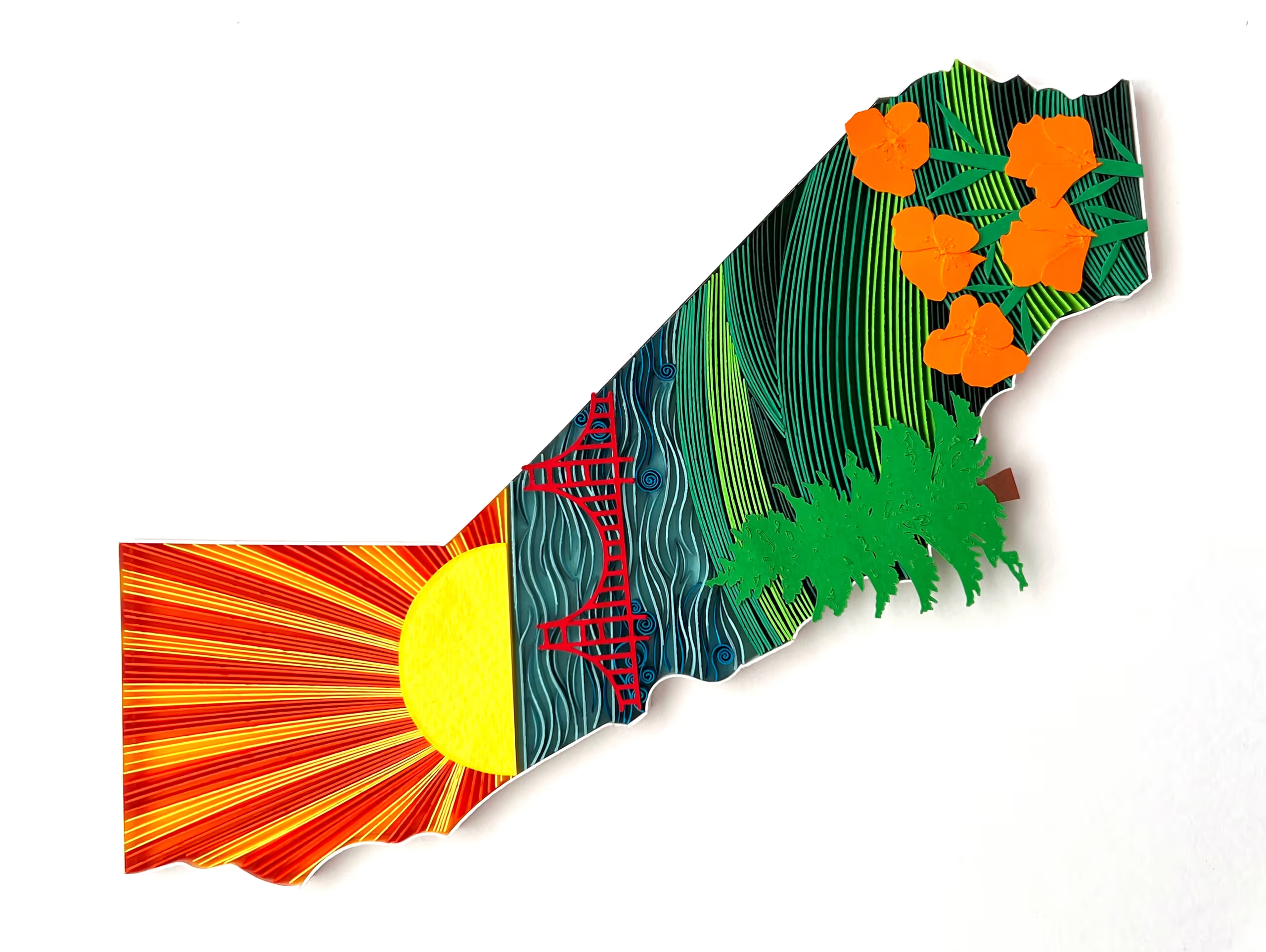
California Love
I’m a paper artist deeply inspired by nature, culture, and personal connections. Using the ancient art form of quilling, I transform strips of paper into intricate, vibrant compositions that tell meaningful stories. Originally from India and now based in the U.S., I blend traditional techniques with modern aesthetics, often collaborating with illustrators to add depth and emotion to my work. Each piece is a reflection of my journey—rich in color, texture, and intention. From wall art to fine jewelry, I create with the hope that every design evokes joy, curiosity, and a sense of wonder. My work has been part of gallery exhibits, art shows, and cherished as personalized gifts that celebrate love and identity. Whether it’s a Tree of Life, a mandala, or a custom initial, my art is a quiet offering of beauty in a fast-paced world. I believe in the power of handmade and in making art that connects people deeply.
In a world teeming with patterns, where chaos and structure intermingle, my dual passion as an engineer and artist is ignited. Fascinated by the harmony that emerges from shapes and colors, I found my medium of expression in the ancient art of quilling. Through Paper Sweetly, born in 2016, I embarked on a creative journey that began with paper jewelry and expanded to encompass a diverse range of art forms, from earrings and necklaces to wall art and sculptures.
Within the confines of my San Jose home studio, I immerse myself in the process of translating my perceptions, moods, and glimpses of inspiration into tangible creations. With each sketch, color selection, and delicate curling of paper, I witness the transformation of intangible ideas into exquisite reality. The entire journey, from inception to completion, fills me with an overwhelming sense of joy and relief from stress.

Calla Lilies In Vase
Steve Walag has been a photographer for nearly 50 years. He earned a Bachelor’s degree in English and Religious Studies from the University of California, Riverside (UCR) and a BFA in Photography from Art Center College of Design in Pasadena, California. He has enjoyed a varied career as a photojournalist, public relations photographer, freelance architectural shooter, photo instructor, and campus photographer at Inland area schools (UCR and Riverside City College). All the while, Steve has pursued his artistic path on the side, beginning decades ago with a strong affinity for the black and white photography of the West Coast “straight” photo school. It is only since 2015 that his attraction to Japanese art led him to formulate the style shown here.
Although Steve’s images may resemble paintings, they are in fact digital photographs printed on textured paper. They were inspired by traditional Japanese paintings in the centuries-old Rinpa tradition. Rinpa artists favored simple, natural subjects – flowers, trees, birds, and landscapes – set against a plain or minimized background. Steve’s fascination with Japanese art led him to emulate those works using digital imaging, lighting, software, and printing techniques.

Candy
Amy Lewis is a self-taught artist from Washington state. Her watercolor and oil paintings are vivid lifelike snapshots of ordinary life glamorized. Amy, inspired by fashion editorials and historic paintings of aristocracy, pairs everyday objects with rich backgrounds. The juxtaposition of the ordinary and the luxurious sparks an appreciation for the things we take for granted. She paints to cultivate joy and an appreciation for the beauty that is all around us.
My work is a practice of gratitude. It is the cultivation of joy and an appreciation for the beauty that is all around us. I’m constantly exploring ways to portray ordinary life as glamorous. Everyday objects with luxurious backgrounds create a juxtaposition that sparks an appreciation for the things we take for granted. In the beauty of the ordinary, I am reminded to be grateful and to use my privileges for the good of others. Fashion editorials and historic paintings of aristocracy are rich sources of inspiration. I work in watercolor and oil paints. For watercolors and oil paintings, alike, I paint roughly 3-4 layers. Many layers mean that the resulting painting has a smooth finish and vivid complex colors. Depending on the size, medium, and complexity of a piece they can take 1-2 days or 1-2 months. Most recently I am proud of being featured in Gita Joshi’s Art Seen Magazine and throwing my own group art exhibition in Seattle, WA.
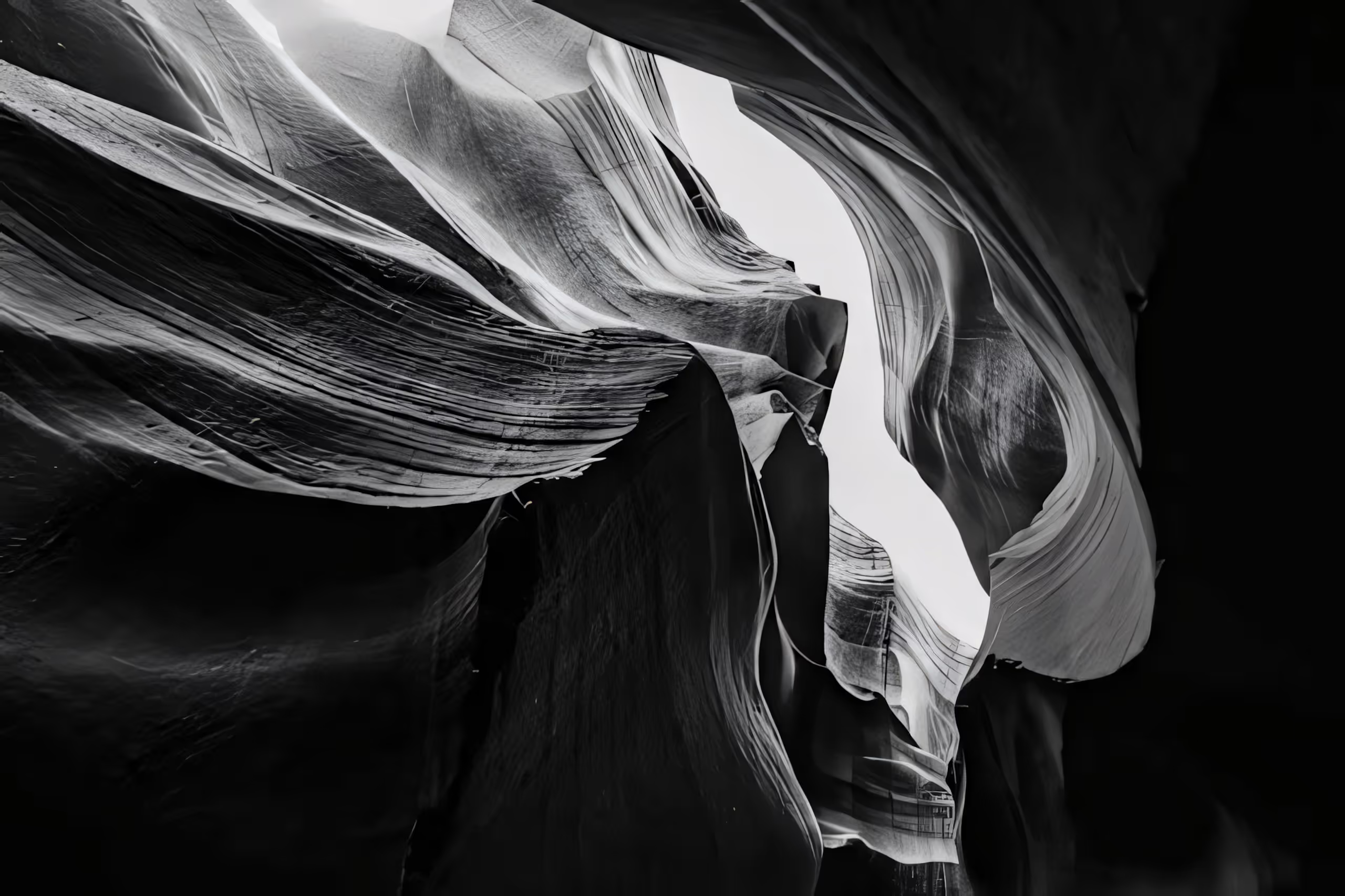
Canyon Whisper
Mital Patel is a fine art photographer whose work explores the relationship between form, minimalism, and emotional presence in natural environments. His imagery often focuses on isolating subjects within vast landscapes, using light, scale, and restraint to create a sense of stillness and contemplation.
Working across wildlife and remote environments, Patel’s recent work has shifted toward more minimal and conceptual interpretations of nature, where composition and tonal control play a central role.
His work has been exhibited and recognized internationally, with a growing focus on fine art presentation and gallery-based storytelling.
Ice exists in a narrow spectrum of tone, where color is restrained, and form becomes the primary language. In this body of work, I explore the Arctic as a study in subtle variation shifts in light, texture, and scale within a limited palette.
Each image isolates a different presence: dominance, stillness, and quiet transience. The restrained blues and greys are not just aesthetic choices, but a way to remove distraction and focus attention on structure and atmosphere.
By working within a singular color space, the landscape becomes less about place and more about perception, where form, silence, and scale begin to dissolve into something introspective.

Carousel Horse
John was born in Columbus Ohio, graduated from Ohio State, and lived in Southern California for 30 years. Although John learned to draw and paint as a young boy, his degrees are in the computer science field. It wasn’t until 2010 when his wife bought him a large easel and encouraged him to start painting again, that he began to take his art career seriously. Since then John has been selected in over 200 gallery shows and juried contests, including the National Oil & Acrylic Painter’s Society 2014 Best in America show. John’s Carousel Horse #1 was featured in the June 2014 issue of the Artist’s Magazine Competition Spotlight, and he was featured in the ‘Artists to Watch’ section of the Southwest Art March 2016 edition. John’s acrylic paintings have been included in AcrylicWorks Best of Acrylic Painting volumes 1 through 10 and his paintings have been voted FAV15% in Bold Brush on a number of occasions.
I was sitting at the bar at a local restaurant one evening and noticed the cascading reflections from the dozens of bottles of liqueur on the glass shelves. I knew immediately that I wanted to paint the scene. As I started gathering photo references my thoughts coalesced around the idea of glass bottles as precious objects. The shapes sizes and colors of the glass and the liquid inside all meld together to sparkle like gemstones.
I had painted several works that featured reflections in water, but never glass bottles. My goal was to get the viewer to see something more than bottles of booze. Some shiny objects that glitter and sparkle.
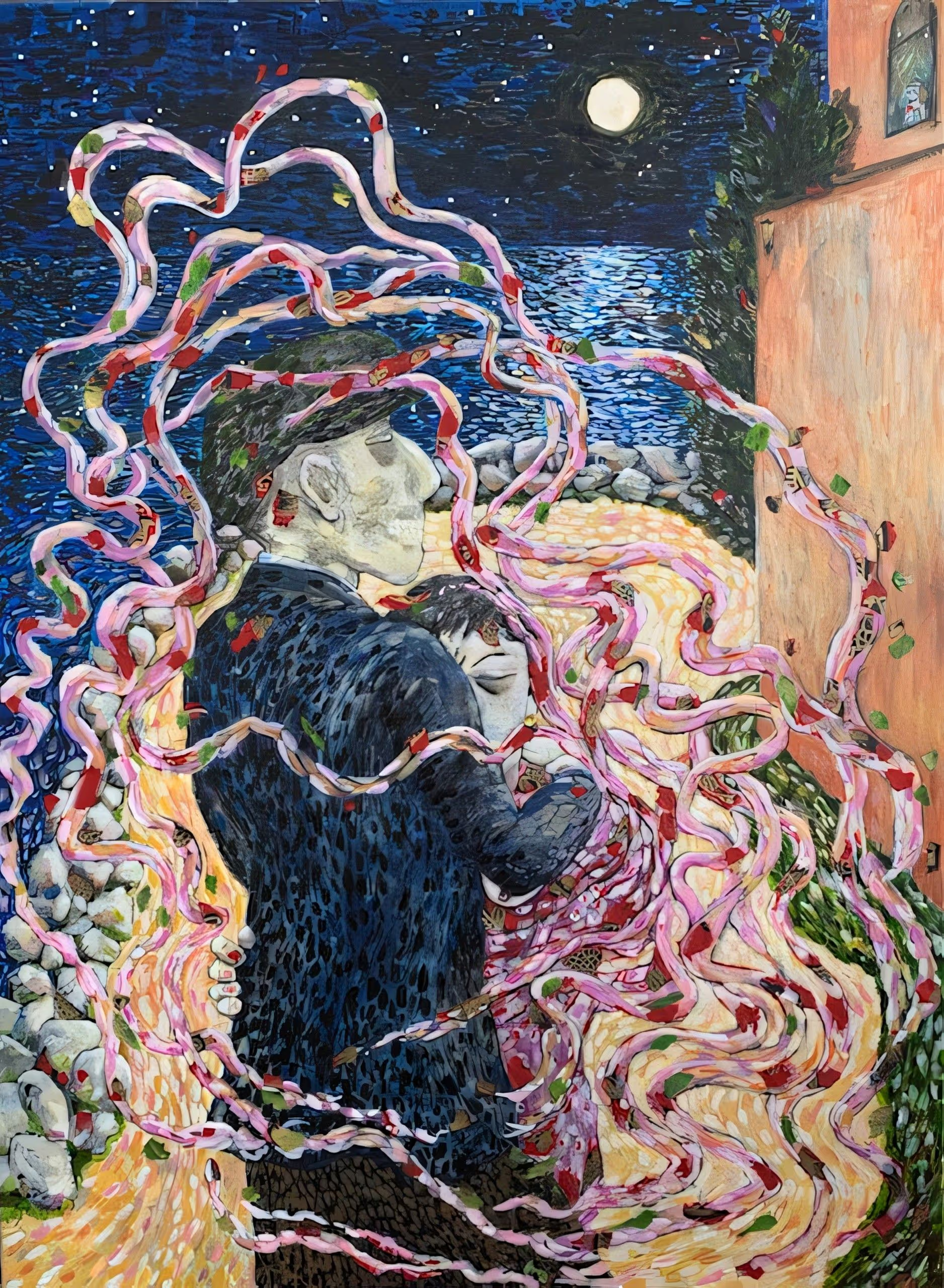
Caruso
Leombruni is a Connecticut-based painter whose work explores the emotional and psychological dimensions of human experience through a lens of expressive realism. Janet Leombruni is President Emeritus of CT Women Artists. She is an Elected Member of the CT Academy of Fine Art, New Haven Paint &Clay, West Hartford Art League, and her work is part of multiple collections in the US and Europe.
Solo shows: Celeste LeWitt Gallery at UCONN Health Center, Arts of Tolland CT, the Monastery Gallery in West Hartford, Atrium Gallery at Raymond Library EH CT, FIAT LUXE at the Art League of New Britain, Workspace Manchester, CT. Leombruni has held artist talks at Kehler-Liddell Gallery in New Haven and the Mattatuck Museum in Waterbury, and was a featured artist for the CWA Art Chat Series. Her work is currently in the Hillstead Museum, Farmington, CT.
Group Shows: Jorgensen Gallery, UCONN, Mattatuck Museum Waterbury, Monastery Gallery, West Hartford, Slater Memorial Museum, CT, Barnes-Franklin Gallery Tunxis, CT, Flinn Gallery with the Greenwich Art Society, Theaterworks, Hartford, CT, CAFA at Lyme Academy of the Arts and Sill Gallery, Old Lyme, the New Britain Museum of American Art, New Haven Paint and Clay, SOHO20 Chelsea, NYC, KBM Gallery Riverside, CA, Rhode Island Watercolor Society, San Fernando, CA, dodomu Gallery, Brooklyn, NY, and San Rafael, CA.
Leombruni received a BA from Hartford Art School, an MA in Education from UCONN, and a Master Plus 30 in Painting and Art Education from CCSU.
In my work, I tell the stories of my experiences in the classroom. I also explore relationships, sometimes utilizing tropes or idioms in the form of children’s literature, myths, films, or portray stories as told to me by my students. I like to examine themes of hope, impulsivity, family, fantasy, innocence, and coming of age. My colors are powerful. Figures often occupy charged, ambiguous spaces, where gesture, symbolism, and narrative intersect to reveal underlying tensions between individuals and their environments. I seek to draw the viewer in, to elicit an emotional response. I like to ask the viewer to determine: What is really going on here?