

The Rabbit
Charles Crabb first started in photography when he was eight years old. The years that followed saw the study of classic photographers, publications, and better equipment, leading to a lifelong fascination with photographic composition.
After a technical career consisting of computer system design, data science, and physical models, Charles is concentrating on his love of the photographic image. His work has been shown in exhibits at the National Orange Show, Riverside, CA; Belmar Arts Council, New Jersey; Art League of Rhode Island; Cotuit Center for the Arts; Cultural Center of Cape Cod; MVA Gallery, Bethlehem, PA; Exhibizone; Click! Festival, Raleigh, NC; Trolley Barn, Poughkeepsie, NY; Louisville Art Association; Indianapolis Art Center; Virginia Beach Art Center; Yeiser Art Center, Kentucky; Marblehead Arts Association (MA); Las Laguna Art Gallery; Wickford Art Association, RI; Old Town Arts and Crafts Guild, LI; and Prairie Village Arts Council, Kansas, and others.
Charles follows the work of many photographers throughout the world but also keeps a hand in the technical development of photographic tools, both hardware and software. He has an interest in how artificial intelligence is used to enhance images.
I am drawn to a moment’s compositional aspects of line, texture, tone, lighting, and context, more so than a photographic opportunity’s documentary aspect. I try to render moments to reveal the way that I see them and feel about them.
While we emphasize tonal characteristics that attract our artistic subconscious when we interpret a moment, we don’t precisely capture what we feel about a scene. But the photo lives to be interpreted by others. When I create a photograph, I understand that others will analyze what it is, and find new meanings in it.
In photography, it is both technique and technology that produce the image. I am careful to understand the camera’s influence on capturing an image and to understand the camera’s limitations; I try to use camera settings to reveal how the image affects me, but the conversation about the story and meaning of the image transcends the involvement with the technology that is used to capture it. Then, using developing tools cautiously, I try to uncover tonal aspects of an image that bring out undiscovered aspects of its form; the image becomes a personal design of an encounter with a particular moment that must be rendered.
As developing tools become more powerful, photographers can develop meaning into their works more effectively, and, inventively. I used developing tools to continue the conversation that I had when capturing the image with the camera. Oftentimes this process can lead to the abstract, but it is all generated by me, with my artistic process.
My photos reflect my environment; they form a record of the scenes where I live and travel that I feel will tell us a little more about how we visually relate to our surroundings
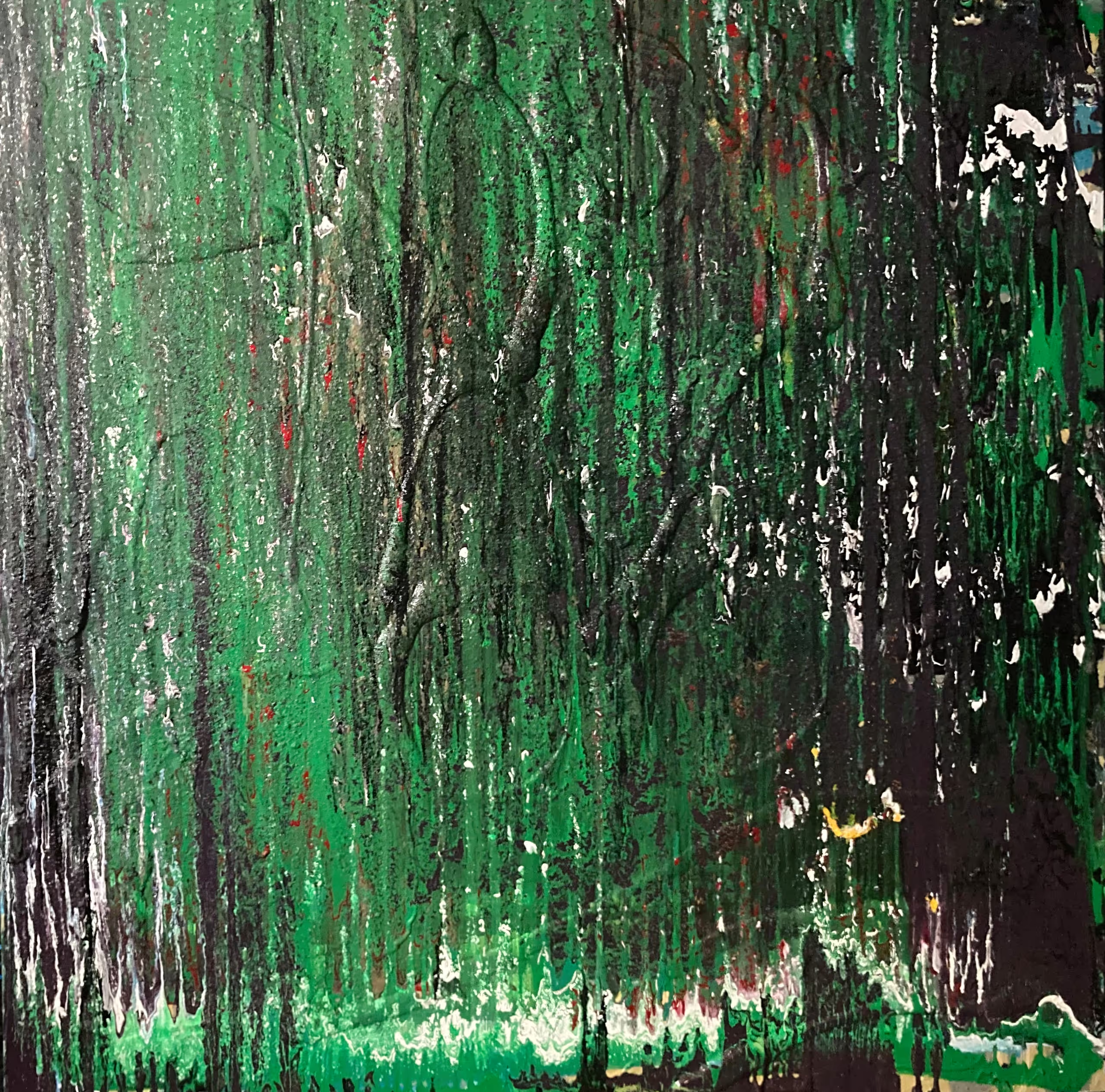
The Rainforest
I was born and raised in NYC, but mostly in The Bronx. I attended CCNY, where I graduated with a BS in Mathematics and an MA in Mathematics Education. I taught high school mathematics in the Bronx. I have always been interested in the arts and started writing poems and playing guitar at age 19. I studied poetry under Professor Robert O’Clair. I studied guitar at The Guitar Workshop. I studied painting and drawing at SUNY Purchase. I have had paintings in 8 live group shows at Jones Gallery in Kansas City, Missouri, paintings at 5 live group shows in Arbor Gallery, Carmel, NY, paintings and photos in 6 live group shows at Putnam Arts Council in Mahopac, NY, and 1 painting in a live group show at the Mahopac Public Library. Also, I have exhibited in many online shows. I have exhibited at HMVCGalleryNewYork virtually since its inception for 3 years. A wonderful state-of-the-art gallery with outstanding artists! My poems have been published in magazines, books, and at HVMOCA. I performed some of my poems in April 2024 and 2025 at HVMOCA with numerous other artists at Writing The Walls. I self-published a children’s book, ”Mr. Fine Goes to the Eye Doctor”, in 1993. My principal artistic interest has been abstract painting and drawing for the last 12 years, but I have written many poems as well. I live in Putnam County, NY
My work in fine arts has principally been in 2 classes of abstract paintings: oils and water-based paints. However, I have completed numerous works in drawing. Recently, I have experimented with spray paints. I focus on color, texture, methodology of delivery, and composition. In composition, I am interested in positive space and negative space as well. I believe the painting/drawing is a manifestation of my emotional state of both conscious and unconscious feelings.

The Rays Of Hope – Kiran
Subodh Maheshwari was born in Aligarh; Uttar Pradesh; North India where she learned folk art and classical music. She passionately believes: “In the threshold of my life; my present is the window to the past and a key to the future”. She acquired her degrees and studied art at Agra University; California State University of Fullerton; and the University of California Irvine. Subodh has won numerous awards; including the Regional Fellowship Award at UCI in 1986; the Bharat Gaurav Award in India in 2015; and the 60 Masters Award in 2017; 2018; and 2019. She is also registered in Marquis’s “Who’s Who in America”; the standard in biographical information. Her paintings have also won awards in a variety of categories including landscape; open; all women; nature; elements; seasons; and abstract.
Subodh is a diversified artist who enjoys telling stories through her artwork; whether it is through landscape; flowers; or abstract art. Her art is a fusion of Eastern symbolism and Western composition; influenced by 16th and 17th-century Rajasthani and Mogul art; and accented by poetry; passages; and phrases in Hindi; Sanskrit; and English. She admires Georgia O’Keeffe for her floral influence; and Frida Kahlo for her courage. Whether it is the serene beauty of nature; her spirituality; or the current political climate; she finds inspiration. Having a life shared between India and America; she sees the beautiful similarities; like love that transcends all borders. Highly individual in her style; her works are described as emotional; mysterious; personal; spiritual; and humorous.

The Rebel
Born in Hungary in the year 1941, I am living in the US since 1980, After 22 years of working at J.P.L. I am retired. I participated in exhibitions in Romania, Hungary, USA.
For the call: “Rebel, Rebel” I want to indicate that is rebellious for a woman not to cover her face in public at certain places.

The Red Queen
The beauty of nature surrounding Los Angeles was the impetus for her entrance into the field of photography. Joanne began vigorously studying photography and other art arenas to hone her skills as a visual artist. In 2000, she graduated from California State University, Los Angeles with a Master of Fine Art (MFA). She is now a full-time artist.
In addition to color and black and white film, Joanne shoots digitally employs the techniques of infrared imaging, and enjoys creating 3D anaglyphs to be viewed with red/blue lenses. As an extension of photography, she has branched out to do videos and has a YouTube Channel, THE VIDEO ART OF JOANNE CHASE-MATTILLO. Along with nature, Joanne frequently photographs female and male subjects in fun-themed studio shoots.
Joanne has exhibited throughout California, nationally, in Korea, France and England, Switzerland, Scotland, Greece, Spain, Germany, Japan, Belgium, Holland, Brazil and Italy. Her work has also been selected for Lunar Codex, a very special project partnered with SpaceX to deliver the images of art in a time capsule to be permanently affixed to the surface of the moon, selected by Era Contemporary Gallery, Philadelphia, Pennsylvania as part of “Legends Of The Moon”.
The more vivid colors we utilize as artists create a mood that influences how the viewer connects to the subject of a photograph. Red can denote passion, love, and even danger. Violet holds the energy and strength of red and is combined with the spirituality and integrity of blue. Using the combination of many colors in a bright image adds cheerfulness and energy to the subject and draws in the viewer.

The Red Rose
Since 2000 Beate Scheller lives in West Linn, Oregon, where she moved to from Germany.
In Germany Scheller got a degree in advertising and design and started to study Urban Development. At PSU in Portland Scheller finished her studies and got her BA in Drawing, Painting, and Printmaking, graduating with Honor 2004. Since then, Scheller worked with different printmaking techniques, mainly with Lithography stones. Her original prints are also from copper and zinc plate etchings, or drypoint on plexiglass.
In 2013 Scheller was able to be a participant at a residency in Bulgaria, where she printed plexiglass (acrylic) plates, using the drypoint technique to make her images. Lately, Beate Scheller worked on these types of plates again, to implement her images, ready to be “etched” faster.
As a teacher assistant, Scheller helped at PSU print studio over several years, introducing students to the Stone-Lithography technique and more.
Beate Scheller’s original hand-pulled prints are mostly small editions, and they were represented in online shows, group and solo shows over many years.
For many years Scheller is a member of Print Arts NW and Seattle Print Arts, and a current member at The Spiral Gallery in Estacada, and Red Trillium Gallery, Troutdale (both Coop Galleries). Before that Scheller was a member of two Coop Galleries, now both closed, where she curated shows and was in charge of the art rotations every other month.
The first impression of my print shows a combination of well-known components, mixed with a touch of fantasy and oddness. Looking twice make reveal new objects or patterns. Then the viewer might recognize obvious or hidden changes appearing in my prints.
Mostly I do hand-pulled prints in black and white, but some include watercolor or chine collé paper. I create landscapes and nature-inspired images with a twist. The original prints include sometimes a natural botanical, collected, and pressed, or have a fantasy element, and even can be turned upside down to see a different point of view.
I do etching and drypoint on copper, zinc, and plexiglass, but also work with lithography stones as an easy and fast way to change surface. Combining these printmaking techniques makes printing even more valuable for me. Sometimes I take an idea further by developing it in multiple ways, adding chine collé or using, in addition, watercolor and colored pencil.
Born in Germany I live now over two decades in Oregon, and traveling in the US, Europe, and beyond shaped my artwork. From those experiences, nature and architecture became the main influences of each piece, with a combination of lines, shapes, and patterns, real or abstract mixed with fantasy.
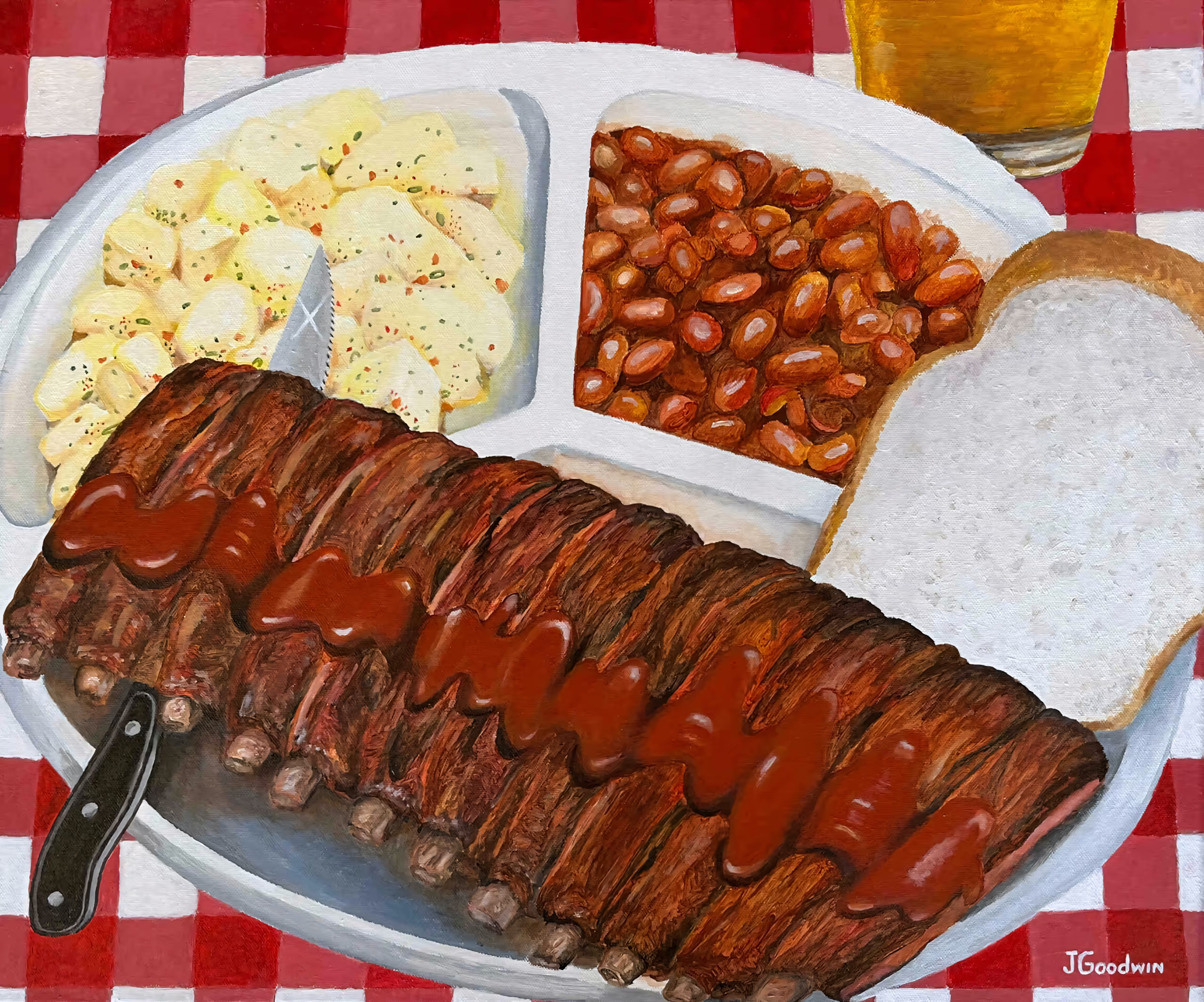
The Rib Plate
John Goodwin studied graphic design at Louisiana Tech University before specializing in limited edition fine art reproductions at a printing company and becoming a full-time artist himself. His “Fun Art” focuses on culture and musical themes and has been featured in many group exhibitions around Arkansas as well as internationally. John’s Blues-related images can be found on Beale Street, at the Delta Blues and Delta Cultural Center Museums, and also at the King Biscuit Blues Festival, where he has been chosen as the official poster artist multiple times.
I consider my artwork “Fun Art”, meant to convey a sense of wonder and whimsy, and my influences come mostly from pop culture. I grew up with Marvel comics, Big Daddy Roth, and Peter Max, so my work is very illustrative, and the graphic elements found in those can also be found easily in my paintings.
A lot of my art is inspired by music – all kinds of music –, and I like to visualize it in bright colors and moving shapes, while also paying due respect to the musicians themselves. I’m partial to the blues and love the deep connection to the soul that music has, so a lot of my work features scenes from the Arkansas/Mississippi delta. I’m also fascinated with cultural symbols of all sorts and am attracted to bright, pure colors, extreme detail, and unconventional but familiar subject matter such as food.
These are the things that interest me, and I try to interpret them all in a colorful graphic fashion that will hopefully make people smile.
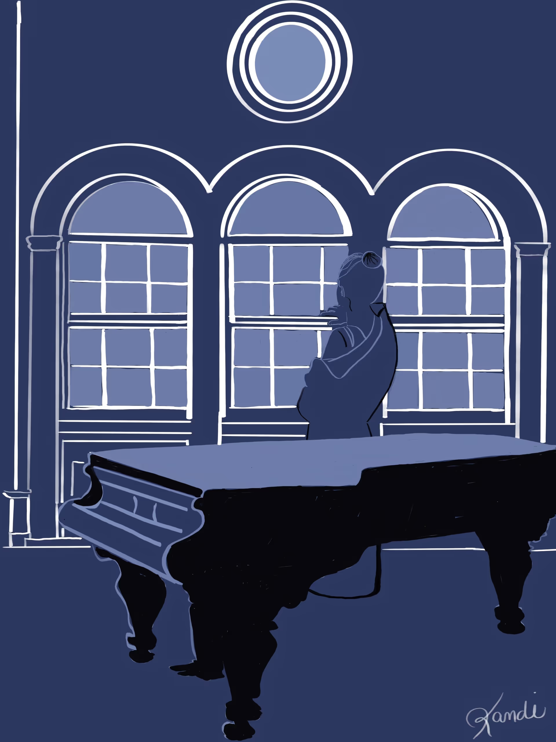
The Room Remembers
Kandi Finney is a multidisciplinary artist whose work bridges painting, drawing, and digital media, with a focus on the quiet power of memory and reflection. Her art lingers in the still spaces of life – moments when silence holds as much weight as sound, when presence and absence become indistinguishable. This sensitivity to pause and reflection is central to her creative process and finds particular resonance in her exploration of music as both subject and metaphor.
In works such as The Room Remembers, Kandi reveals her deep interest in the relationships between people and the spaces they inhabit. The piano, for her, becomes more than an instrument; it is a symbol of memory, longing, and potential – an object that carries both sound and silence, performance and pause. Her ability to distill these themes into visual form demonstrates her ongoing exploration of how art, much like music, resonates beyond what is immediately seen or heard.
Kandi’s practice spans oils, pastels, watercolor, and digital painting, each medium chosen to serve the unique character of the subject at hand. She often works with a restrained palette and simplified forms, allowing line, shape, and tone to speak with clarity. This economy of means creates space for viewers to project their own experiences, engaging them in a dialogue that is at once intimate and universal.
Her work reflects an enduring curiosity about human connection – the bonds between individuals, their environments, and their inner lives. Whether depicting a desert horizon, a fleeting sunset, or a solitary figure at rest, Kandi invites viewers to pause, reflect, and recognize themselves within the scene.
Based in New Mexico, Kandi continues to expand her artistic voice by weaving together themes of stillness, memory, and resilience. Her paintings have been exhibited in group shows, where they are noted for their emotional depth, contemplative tone, and the timeless sense of quiet power.
The figure at the piano is a meditation on stillness, presence, and the quiet dialogue between music and silence. In this work, I explore how a single moment- and an individual standing in contemplation near an instrument- can hold the weight of memory, longing, and reflection. The piano becomes more than an object; it is a vessel of unspoken emotion, a bridge between the physical and intangible.
The composition emphasizes space and simplicity. By reducing detail and allowing form to emerge through light, shadow, and line, I invite the viewer to enter the scene with their own imagination. The figure, turned inward, does not perform but instead pauses in private exchange with the piano. This moment of restraint becomes powerful, reminding us that creativity often resides in silence as much as in sound.
My choice of limited color and strong contrast was intentional, echoing the way music moves between tension and release. Just as a piano key strikes and fades, the hues in this work rise and settle, suggesting rhythm without a note being played.
Ultimately, this digital painting is about connection – the way we encounter ourselves when faced with art, memory, and space for reflection. It asked the viewer to slow down, to stand in the quiet with the figure, and to feel the resonance of absence as much as presence.
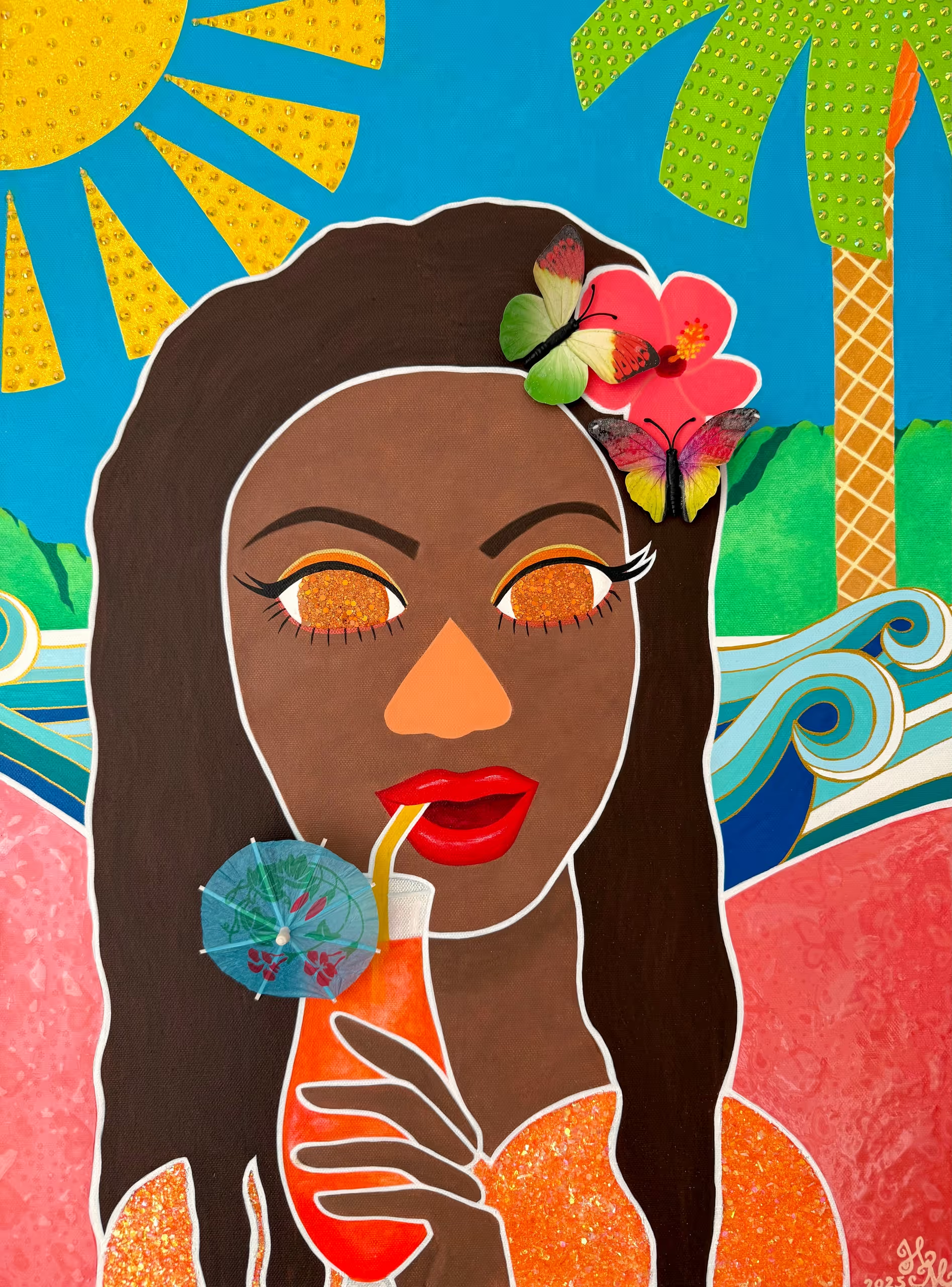
The Rum Fairy
Heini Mika is a Finnish artist living and working in New York City. Heini holds a Bachelor’s degree in Fine Arts from the University of Worcester (UK) and she also has a degree in Fine Art and Visual Communications from Finland’s prestigious Pekka Halonen Academy of Art. Heini’s paintings have received global recognition, being showcased on four continents in prominent locations such as NYC, Paris, the UK, the UAE, and Indonesia. Her artworks have been featured in many notable publications, including the British Vogue, and several of her pieces are cherished within private collections.
Heini’s ultra-contemporary paintings serve the viewer with a palette of vibrant colors and dynamic shapes while she gives you her unique perspective on women, fairytales, and history. They have been an important source of inspiration for Heini throughout her career as an artist and this can be observed in her rich and intriguing original artworks.
Since forever women have been the subject of great art, but rarely were we allowed to create great art. As a female artist living in the 21st Century, I find great inspiration in the female icons of the past. Famous women from Marie Antoinette to Miley Cyrus, have served as profound sources of inspiration for me, due to their distinctive styles and unique spirits. In my art practice, I explore the contrast between the public portrayal of the women I admire and their true selves. My aim is to discover how the images of these influential women, given by pop culture, impact and shape my own artistic impressions of them. Just like the women I paint, I am an unconventional woman in the eyes of my society and with my art practice I want to invite viewers to look past the glittering images and see the depth and complexity of the women I paint, myself included.
Ultimately, my work serves as a reflection and exploration of this complex dynamic. While my intention is to showcase the vibrant and visually captivating image that pop culture has crafted around the women I idolize, I also remain very conscious of the underlying darkness that hides beneath the surface of their seemingly lighthearted images.
As a Finn, I grew up on satire, dark humor, and happy endings and that is well reflected in my work. At first glance, my cartoonish mixed media paintings may depict my subject’s pop culture image perfectly, which is usually colorful, ditzy, and lacking in substance, but I am actually satirizing our perceptions of my female heroines. We are all guilty of prioritizing a person’s image over the narrative. But whether the viewer understands this duality or not, I still want them to have a good time when viewing my artwork.
I choose to work with acrylics, rhinestones, and glitters because their vibrant hues and plastic textures are well suited for creating eye-catching artworks that are unique to me, and perfect for the subject matter.