
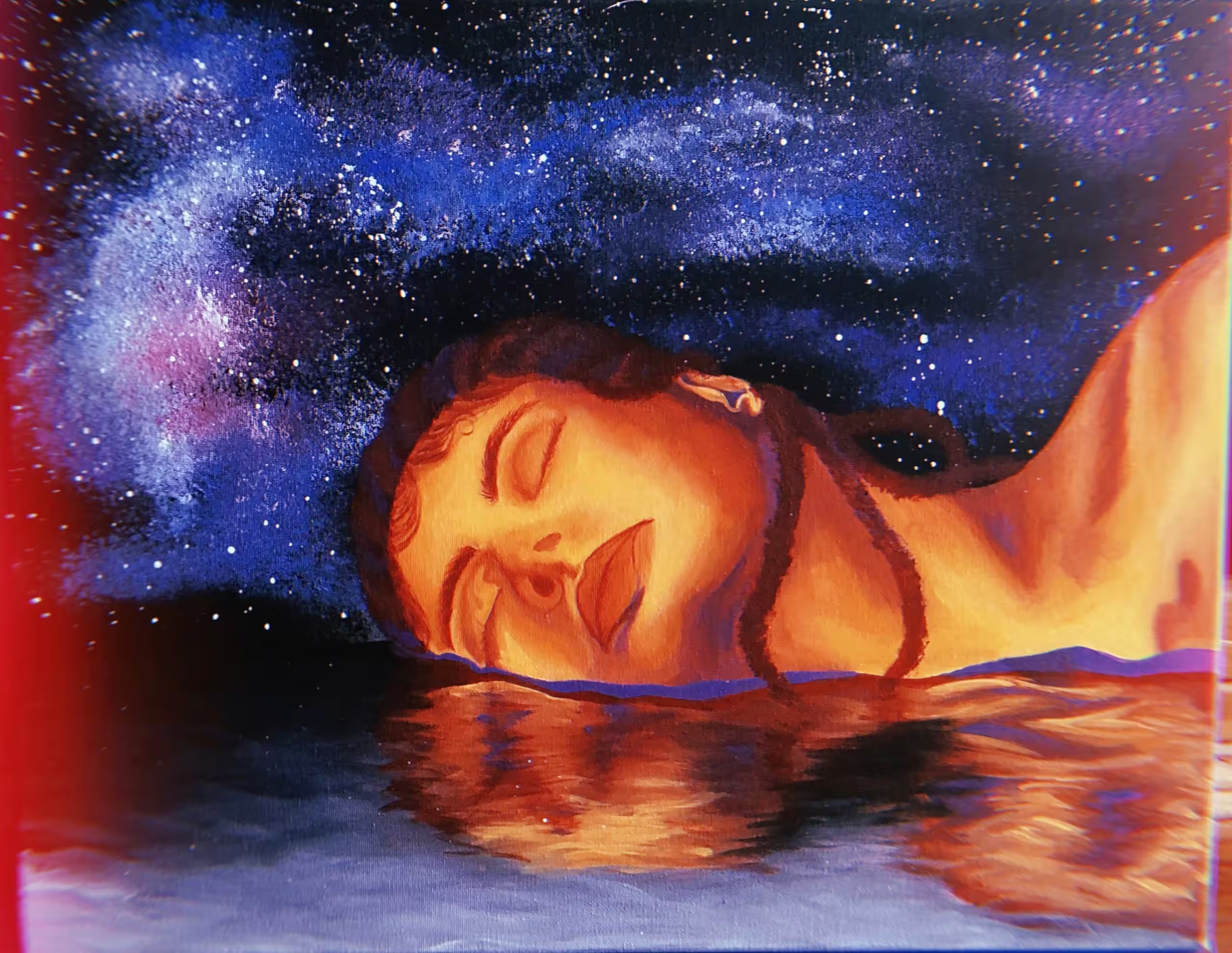
Lady In The Water
I am a Texas-based Artist with a passion for flowers, colors, and design. I have a background in theatre and events, as a Scenic Designer and Painter. I love to make art for and with others. Although I’ve had some sour experiences in my art journey, I’ve made just as many wonderful experiences and friends along the way. I love and thank my mentors. They guided and supported me as I found my confidence in myself and my skills.
My vision for my art and the future is to create a space of healing and transformation, incorporating artistic techniques and outlets to serve as a therapeutic resource.
Describing my art is difficult. I’m still learning what it is and isn’t, who I am; learning myself through it. As a survivor of SA, a yearning young woman, and an uncertain artist, I depict and release these things that burden my heart, mind, and spirit.
My art is colorful and whimsical, yet most, if not all, have a serious side. The subjects I choose usually relate on a deeper, personal level; either loss or lessons. The preferred medium I use is acrylic paint, although sometimes I incorporate mixed media. I’m also a sculptor/chainsaw carver, however, I primarily paint due to accessibility. I have a theatre background, with lots of fantasy and surrealism, which rubbed off on my art. Most of my work seems to dip a toe in that realm. Ultimately, I just aim to explore colors and the emotions they elicit. I love color theory and a good blend.

Lady Luck
Karen Sachs’ art is an online gallery selling paintings, mosaics, and oil pastels of landscapes, animals, people, and abstract pieces. Karen Sachs, the artist behind the company, started painting to reveal her soul and explore her emotions. Her paintings are based on her life experiences and allow viewers to see the world through her eyes.
My art is about self-expression, creativity, and healing. I was born with a creative soul and an innate desire to explore the beauty of life. My abstracts reflect my passion for color and movement, while my landscapes depict the serenity I find in nature. Art is about revealing our true nature and benefiting from its healing powers. My art invites viewers to explore their creativity and celebrate their unique expression. My work is exhibited in solo and group shows throughout the United States; my paintings are held in private collections worldwide.

Lady Madonna
Even at an early age, Marissa has shown an enthusiasm for illustration. She can recall spending hours creating and illustrating stories inspired by the many books her parents shared with her. That inspiration has led her to some of her greatest artistic passions, including children’s book illustration and portraiture.
Marissa earned her BFA in Illustration at the Hartford Art School in Connecticut, where she found new inspiration in her professors. While there, she received many distinctions for her work, including the best portfolio in each of her departmental portfolio reviews. She has also had the honor of having her work featured in numerous exhibitions, including the Society of Illustrators Annual Student Scholarship Competition in New York City.
Since graduating from Hartford Art School, Marissa has continued to follow her passion as a freelance illustrator and portrait artist. After completing her first children’s book illustration project, she went on to be featured in numerous publications and television appearances. Her projects have included collaborations with ESPN, as well as creating illustrations for Hartford Symphony Orchestra’s yearly concert production “Tales of Halloween”.
My artwork is very much inspired by visual storytelling. The thing I love most is capturing my subject’s likeness through vitalizing details – both on the surface of the artwork, as well as the narrative behind it.
I often use a mixed media approach combining acrylic and colored pencils. Working this way combines the freedom of laying bold washes with the tight control of drawing. As the piece is built up in many thin layers, I can carefully explore all the details. Quilting these details together as a visual story is where I find my greatest artistic passion.

Lakeside Colours
Dixie Allen explores the planet through adventures in Photography, Art, Nature, Travel, and Hiking. Her Lens-based Photography and Art Curation reflect a passion for these interests.
Photographic images appear in numerous exhibitions and publications, including Scotiabank CONTACT Photography, ORION Magazine US-based Global, Women’s Art Association of Canada, Todmorden Papermill Gallery, Visual Art Open23 U.K., HMVC Gallery New York City, Sotheby’s Art Institute U.K. Art Curation and Art Marketing, Visual Artist U.K. Art Sales and Exhibition Management, collectively pave a path for Curation projects including ECHOES Juried International Art Exhibition, Hotshots Photography, Through Hikers Lens Photography and Dynamic Range Photography Exhibition, A published author and public speaker bringing storytelling to the forefront.
McGill University Executive Management graduates with an accomplished career in Business and Finance. Dixie brings decades of Business Leadership with a dynamic range of creative skills into the evolving world of Art. At present, Scholarship Program Chair at the Women’s Art Association of Canada.
Dixie Allen | Toronto Canada
Chasing the light in all its ranges and catching a glimpse of extraordinary moments are the primary inspirations for my lens-based photographic images. As light shifts are swift and fleeting, camera craft, photographic composition, and depth of field are applied with urgency to create the image the moment created it.
Photographic images capture a play of light on reflective surfaces bringing moments of distortion into harmony with colors, shapes, and movement by applying in-camera composition to create the essence and energy of the moment.
Photographic works take full form through storytelling, be it factual, imagined, or a shared experience with the viewer. Images are printed on Live-Edge Archival paper, Giclée Canvas, Acrylic or Metallic substrate as best enhances the atmosphere of the composition.
The Art of Photography changes like the light. Each moment introduces a refreshing perspective, taking this photographer on a never-ending journey of discovery to capture the beauty in the world we share.

Lakota Black Hills Dancer
Frank “Chip” Mayes
A native of Pensacola, Florida
Influenced early in his childhood by the National Geographic magazine and the pictures he saw. Classical Greek art fascinated the youngster and then Roman Art…and then the great masters and art history. He found the Renaissance and Baroque periods of art most exciting and entertaining because of the stories the paintings told.
He began serious oil painting with a local art teacher while in Junior High, now called “Middle School.” High School provided a better opportunity for experimenting with various media. In college, he was an Art Major.
His real education as an artist began after college when he went off to Europe to explore and see what it meant to be an artist. He was fortunate to be able to study art at the National Gallery as well as the Tate Gallery in London, the Louvre in Paris, and the Uffizi in Florence. Many hours were spent in the MET in New York.
Frank Mayes is a painter of Realism.
Frank “Chip” Mayes
Artist At Large
Giving time to paint is an act of faith. To this world it will hardly appear noble, purposeful, or praiseworthy: and yet, painting reincarnates in every generation. “We have but to wait— until with the mark of the Gods upon him— there come among us again the Chosen— who shall continue what has gone before.”
James Whistler
“We alone, of the thousands who walk this earth, we alone in this hour are doing a work which has no purpose save that we wish to do it”
from Anthem, by Ayn Rand
The artist has a triple responsibility to the non-artists: (1) He must repay the talent which he has; (2) his deeds, feelings, and thoughts, as those of every man, create a spiritual atmosphere that is either pure or poisonous. (3) These deeds and thoughts are materials for his creations, which themselves exercise influence on the spiritual atmosphere.
Wassily Kandinsky
“I am a painter, a visual storyteller, an observer of people, places, and things.”
Frank Mayes

Land Confluence
I left doing art for years until I discovered photography through supporting Adobe Lightroom. Photography allowed me to develop my artistic vision. I wanted to push photography further, so I started fusing more than one of my photographs in Photoshop, then adding some of my drawings. I started drawing again a few years later, rediscovering the love I had for ink. When the colors in watercolors weren’t strong enough, I started painting abstracts in oil that are based on aerial land photos, and convey my love of bold, bright color.
I spent my childhood around Narragansett Bay, so water has always been fundamental to me. My fusions started with photos of the Pacific ocean beaches, and continued by including ponds, lakes, and photos of aquariums.
Photos from the plane window showed me patterns in the land that- natural or man-made – grabbed my attention, but they had to wait for an idea. With retirement glowing in front of me, I tackled something that had defeated me in college: oil paint. I turned to two of my favorate painters, Richard Diebenkorn and Wayne Thiebaud for inspiration. Using photos I’d taken on a rock plateau outside Santa Cruz. and those from the airplanes, I created sets of abstract paintings, trying to achieve a similar color energy that Thiebaud infused in his paintings. Ideas for new patterns and new ways to use colors came from experimenting with the paint itself, as well as using other photos as the basis for subject, pattern, and color exploration.

Landover
Originally born in Montevideo, Uruguay, Jorge is an artist and professor in the Washington, DC area. He specializes in writing, music, and photography. In 2021, Jorge obtained a Master of Fine Arts in Visual and Performing Arts with a concentration in photography from George Mason University.
As an avid photographer, Jorge’s work has been exhibited in galleries and print. Past publications include DCist and The Washington City Paper. As a musician, Jorge has played at major clubs along the East Coast of the United States and abroad.
With over 20 years of professional experience, Jorge has worked as a journalist, translator, and graphic designer with companies such as United Press International, The Washington Post, the Spanish news agency EFE, Maya Advertising, and the Office of Minority Health Resource Center.
Jorge is currently working as an adjunct professor of digital photography and film photography at George Mason University, Northern Virginia Community College, and the College of Southern Maryland.
My photography, video, and music deal with documenting what exists in the periphery of cities and that is semi-rural, semi-urban, and could be a wasteland, a forgotten place where nature still thrives in the middle, on the side. or despite the human-made world. This kind of work has been called topographic photography — some of it would be considered ugly, depressing, and boring at first glance — and it is Images of places that are hiding in plain sight, that I like to explore, somewhat away from the noise of daily life. I like to present these places as they are, without a narrative, and open to interpretation. It could be said that the state they are in is in itself an interpretation of human interaction with nature. I find these spaces sometimes stimulating and unsettling, at other times peaceful and calming. I like listening to music before I photograph, mostly ambient or electronic music, to clear my head and get into an almost contemplative, reflective, meditative, and zen state.

Landscape 1
Assistant professor in the faculty of Architecture Urban Planning College, Zhuhai College of Science and Technology (2012).
Education:
BFA, 2002, Hebei Normal University;
MFA, 2010, Tianjin Academy of Fine Arts.
MFA, 2000, School of The Art Institute of Chicago.
COOPERATIVE EDUCATION PROGRAM
In May 2015, I initiated the“China-US Design and Cultural Exchange Studio program” at Grand View University, USA.
In January 2016, at the invitation of Grand View University, USA, to launch the“China-US Design and Cultural Exchange Studio program”.
Publications:
Sole author, “Print Marks and Aesthetics of the Times” and “Print Marks and Print Culture”.
Sole author, the paper “Color Evolution in Western Painting” won the first prize in the implementation of the new curriculum and in the selection of essays for teachers’ professional development.
The paper “Adapting to Market Demand, Promoting Professional Development – My Understanding and Consideration of Art Teaching in Middle Schools” won the third prize at Beijing Annual Conference.
EXHIBITION EXPERIENCES
Painting, Joyous, awarded 2021Delights And Shadows Exhibition by California Art League.
Woodcut print, Eaves Tile was selected for the China-South Korea Exhibition, South Korea, January.
The copperplate print, Experiences of Life was collected by Zhuhai Art Gallery.
The copperplate, Experiences of Life, was selected for the 6th Printmaking Exhibition of Guangdong Province.
Water Color Landscape was selected for the Sixth Fine Arts Exhibition of Hebei province and won the first prize in the Youth Group.
The copperplate print, Life-Pregnancy won the first prize of Youth Group of the 6th Hebei Province Art Exhibition.
The silkscreen, Autumn Rains-Impressionism won the Excellence Award at the 5th Hebei Province Art Exhibition.
The copperplate print, Life-Pregnancy was selected for the 11th Tianjin Art Exhibition.
The silkscreen, Summer-Impressionism was selected for the 6th Tianjin Youth Art Exhibition.
Why use plastic bags as the material?
My ideas are based on how human beings use and consume. Today, human consumption has an impact on the environment, ecology, religion, and spirituality. I am concerned about plastic pollution. Plastic bags penetrate people’s daily lives in China. People use plastic bags to carry different things, such as goods, food, garbage, and so on. It has become a part of the scenery in people’s lives. Also, these everyday items pollute the environment, people still use them.
Besides, During the whole year, I did collage every day, and my father complained that I should practice skills of handwriting or skills of drawing. So I use plastic bags to make these landscapes, as a silent rebel against my father, to patriarchy. My father practiced handwriting every day and drew Chinese traditional paintings every day. That is why I chose the Chinese Traditional Landscape as the theme.
Chinese Traditional Landscape also symbolizes Chinese traditional culture.
The concept of this work aims to show the different educational backgrounds between my father and me. and reflect the difference between Chinese traditional art and modern art in terms of ideas, skills, and materials.
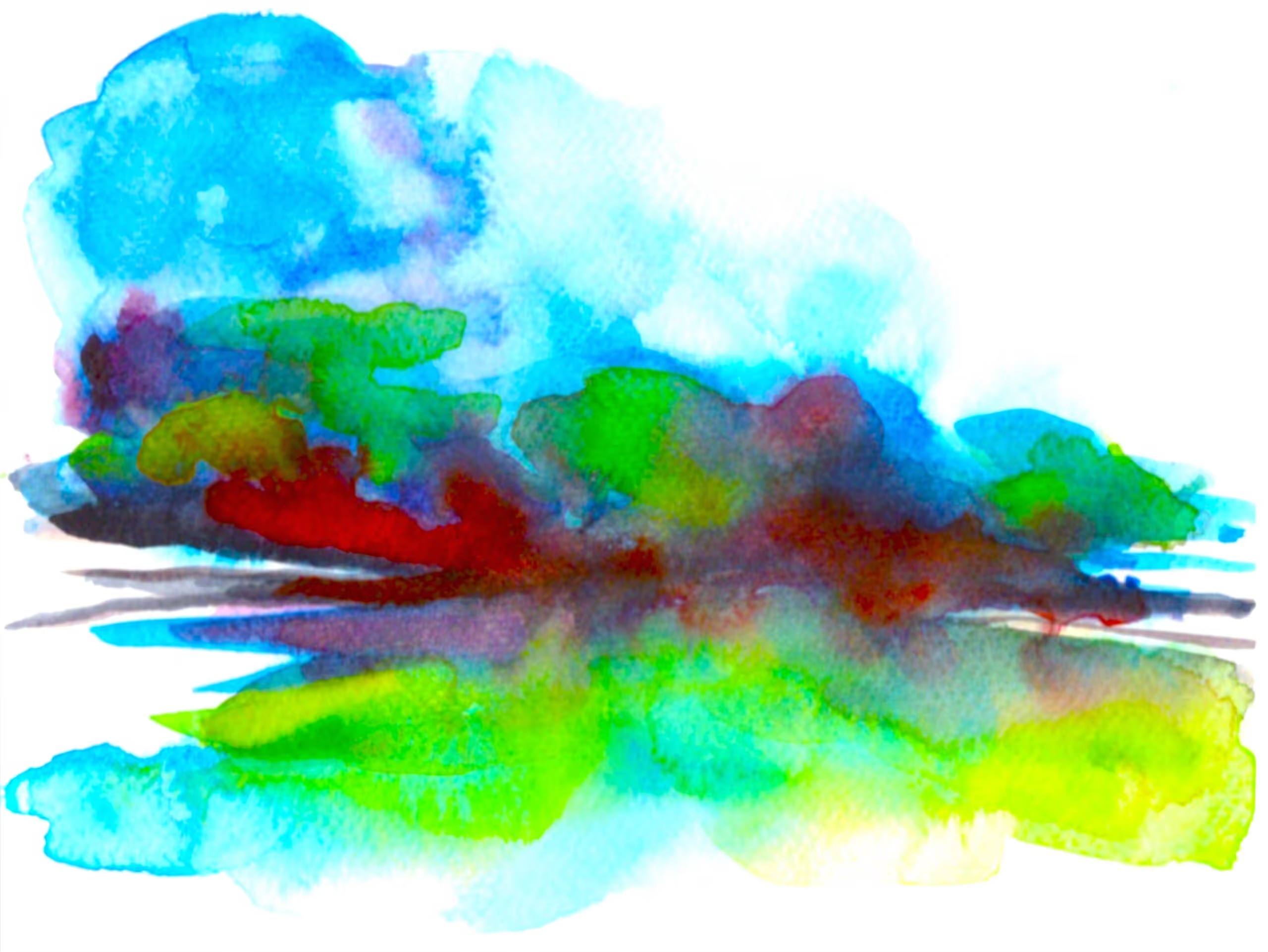
Landscape 1
Anthony Alexander received his formal art instruction at the Ontario College of Art, where the focus was on an academic interpretation of the human figure. The idea was that you had to learn the fundamental rules of academic drawing and painting in order to understand how to break them.
For over 35 years, he has worked in the digital medium as an art director, with Photoshop being his primary image creation tool. He also explored this medium and how it could be applied to fine art, but a few years ago, he realized that he wasn’t satisfied with the process. Something was missing, and that something was working with traditional organic materials and reflected light, as opposed to projected light.
He shifted his method of creating art back to using acrylic paint and watercolours, and to drawing every opportunity that he could. He uses acrylics because of the many vibrant colours available and, unlike oils, their quick drying time and the ability to use water as a mixing medium. Another advantage to acrylics is that, in addition to being an opaque paint, they can also be treated as a transparent medium. In this application, they are similar to watercolours, but he still enjoys the spontaneity of watercolours and paints with them often for more non-representational subject matter and as a means to “stay loose.”
“Colour is energy made visible.” — John Russell
I just love the subtle vibrations you feel in your fingertips as you drag graphite over textured paper or your brush over a freshly primed canvas, and it was organic sensations like these that I was missing in the digital process.
The paintings I have created for this show are all done with watercolour on paper and emphasize strong primary colours, which I build up gradually by using wash glazes and abundant under-painting for the desired effect. The many layers of paint used to get to the desired colour increase the overall density of the finished artwork.
I have also chosen non-representational subject matter because I am passionate about biomorphic shapes and equally fascinated by the “Fibonacci sequence” and ideal proportion that is so prevalent in nature. It is easy to see why so many artists derive inspiration from the variety of abstract shapes and colours found in these subjects.
Colour is so important to me because it’s colour (coupled with subject matter) that gets the most emotional response when looking at a painting. Only colour, however, has the ability to engage the observer in a subjective experience entirely on its own, and it is this type of experience that I am striving to attain.