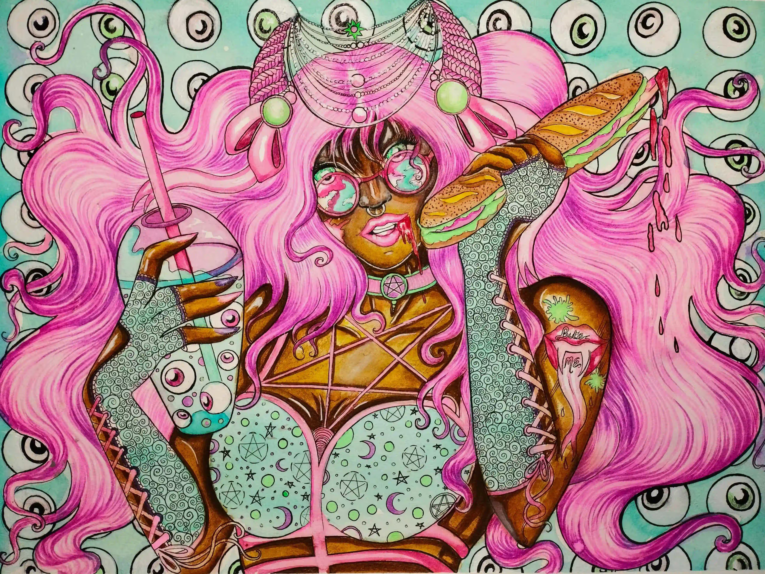
★★★ Mirage ★★★
As an Irish-born Artist and Poet, Chadains’s work is heavily inspired by ideas of fantasy, classism, and the movement of feminism concerning the rise of the 4th industrial woman and her place in society. Chadain’s art and poetry have been exhibited and published worldwide, from featuring in Poetry Ireland’s Queer Anthology of the next generation of Irish Creatives, to work exhibited from Serbia to the USA.
My hyper-feminine imagery and style are used to discuss our modern distaste for femininity, despite its allure. This a perfect dichotomy with modern cultures’ obsession with beauty but contempt of feminine interests, impressions, and representations.
My practice is partly born from my aphantasia and astigmatism, quirks that leave me unable to visualize normally, something which lends itself well to my continuous iteration process.
I merge my experience as an outsider artist with my intersectional feminist and classical lens. I studied the classics, both in texts like Medea and in the art to give myself an understanding of what was created in the male gaze so I could truly paint my feminine subjects and femininity from an informed gaze. An art movement is never finished until every gaze is seen and every story is accounted for.
I prefer to engage the viewer in the intersection of poetic language, technology, and visual symbolism to discover the impact of my ideas on the viewer, emotionally challenging the viewer on their preconceived notions of what it means to be feminine.

★★★ Movies ★★★
Ronaldo Byrd was born and raised in Brooklyn, New York. He is a Contemporary Hip “Pop” Artist who began painting at the tender age of 3. As an early teen, Byrd was accepted to and attended Art Instruction School, which boasts graduate, Charles Schulz. He graduated and received a Diploma in Art from Art Instruction School at age 16. While enrolled in the course, Byrd was also attending The High School of Art and Design in New York City, before moving to Burlington, New Jersey. Byrd then was accepted to and attended Burlington County Institute of Technology, where he majored in and received a Diploma in the field of Advertising Art and Design. Byrd is mostly a self-taught Artist who has developed his own style of art and his own characters, which he puts in phenomenal scenes. He has shown his work in several galleries, including a solo show at Michigan Medicine in Ann Arbor, Michigan. Byrd and his artwork have also been featured in several newspapers and magazines. One of which includes, The Philadelphia Inquirer. He has also been a feature story on CBS 3 Eyewitness News. Byrd’s message to the world through his artwork is one of love and acceptance. His hope is to convey this as boldly and as beautifully as he can.
I am a Contemporary Hip “Pop” Artist who just happens to be on the Autistic Spectrum. My artwork focuses on the fact that everyone is beautiful regardless of race, color, ethnicity, gender or sexual orientation. The bold colors I use represent the way I see the world. There is beauty in everything I see and I believe that everyone has something to offer to the world in their own special and unique way. Thus, I have been deemed “The Artist of Happiness” because of the joy that my artwork brings to countless people. My art and I represent differences and my hope and goal is for the entire world to be able to see beauty and acceptance through my eyes—-the eyes of an artist.

★★★ Peace ★★★
Nikki is a Fine Artist based in the South Lakes, Cumbria, UK. Nikki studied Theatre Design in Birmingham before completing a PGCE in Lancaster and a MA in Film and TV Production Design in Kingston. After completing her studies Nikki went on to be Head of Art and Design, Photography, and Media Studies in a school outside London before moving back to the Lake District in 2010. Nikki currently teaches full-time A-level and Post 18 Art, Design, and Photography as well as working on her own creative practice. Nikki has always worked on her own creative practice whilst working full time and completed commissions over the years in a variety of media and subject matter as well as being a lifestyle and wedding photographer for a short time.
Nikki lives with her Italian husband and two boys and can be found avidly reading or walking their beagle in the beautiful surroundings of the Lakes when she isn’t teaching or being creative.
When I consider my own artwork, I often struggle to find the words to describe my work, creating art is a need for me, to unload my thoughts and emotions. My artwork comes from within and often contains locations or motifs that are personal or from my surroundings. I have always enjoyed color and nature, and when I paint, I love exploring different color palettes to provoke different emotions and feelings. Art to me should be something to be enjoyed and bring different meanings to those who look upon it.
I enjoy working with portraits, the human face can show a variety of emotions and can create mystery and intrigue. I have a passion and love for lighting, color, and a sense of narrative within my work due to my background in film. My love of narrative and storytelling within the image, I hope creates intrigue and invites the viewer to interpret ideas for themselves, to question and be thoughtful.
During the pandemic, painting was my lifeline. I enjoyed rediscovering color within portraiture and using elements at juxtapositions to develop compositions that created new ideas. My work contains motifs of floral elements associated with emotions, feminine traits, and awareness of balance within compositions, through color and texture. The lockdown gave me time to re-energize my artwork and reflect inwardly to express outwardly in my painting. Through expressing floral elements, I have explored the Queen of flowers the peony in recent work. A flower that can bring joy and beauty into the world during some dark times. These flowers represent regrowth, strength, and resilience as well as feminine beauty and softness. My most recent work has explored Goddesses and the divine feminine with symbolism within the flowers selected, colors, and other elements helping to tell a story.

★★★ Rebel ★★★
Paul Pinzarrone studied classical piano, biology, and chemistry. He explored playing the keyboard in various rock & roll bands, playing piano for musicals, singers, and dancers, and also worked as an orderly in a trauma center emergency room and surgery. He studied art history and painting at the University of Illinois, earning a BFA in Painting with Highest Honors. Graduate work was done in painting and drawing at Northern Illinois University and the University of Wisconsin.
Paul taught drawing and design at Rockford and Rock Valley Colleges and exhibited at juried contests and galleries in Chicago, Miami, Louisville, Muskegon MI, Ohio, and New Orleans. Exhibitions include the Art Institute Biennial, Butler Institute of American Art, Gilman Gallery, Horwich Gallery, Union League Juried, and Zhou B Art Center [Chicago].
Earlier work included photography, acrylic, and airbrushed lacquer constructions on Plexiglas. Matching the process to the imagery, Pinzarrone pushed the science-fiction look of spraying bronzing powders with acrylic lacquers for an inaccessible, reflective presentation. Film photography transitioned to digital and airbrush turned into an electronic version with Photoshop and other painting methods. To be “art”, Pinzarrone contends that it must be a new…. new version of a Vermeer or Michelangelo or Titian using digital photos, photoshop, and fractal software, printed on Plexiglas or aluminum. It must have a new look, using new materials, presenting a new approach to how great masters saw life.
Current work includes numerous texture-free digital layers, photographic manipulation, and a high gloss machined-looking flat piece. The viewer tries to solve puzzles of why the figures are emotionless and passive, all expressions have been wiped away with most wrinkles and blemishes. The figure’s skin is Pinzarrone’s canvas now, drawing from Titian and other master themes and poses. Tensions are explored to pull the viewer to wonder if it is a photograph or a fabricated reality. Craftsmanship counts.
This work is a study of how nature and power rhyme. It is a study of candy-colored puzzles displayed on high gloss aluminum or plexiglass and metallic paper. The viewer is drawn in to feel comforted yet disturbed, pulled towards the work but paused at the detachment. All are invited in to play and explore…. and wonder if these are mirrors, this science fiction, some other-worldly situation, or nightly dreams.
Process Remark:
This work is digital…. I use Flame and Amber software, fractal software for patterns, painting software for digital airbrush & air erasure, and digital photography to show you my world. Images are built up using transparent layers. After they are compressed, I wrap them around figures and build up additional transparent layers. The figure skin is my canvas presented as though photographs of tattoos, painted figures, or something else. Darker pieces are printed on high gloss aluminum while higher color work is printed on metallic film and bonded to the reverse side of clear plexiglass.

★★★ Rescue Me ★★★
Cher Pruys, ASAA SCA, IGOR, AAPL, CSAA, AMS, LMS, OSA, MAA, CFA, NOAPS, PSOA, AWA., AAOA.
“To take my inner visions with my hands and create a work of art for you the viewer… That is the ultimate in self-expression.”
Cher Pruys was born in Regina. Over the years she lived in many places including Saskatoon, Calgary, Edmonton, Ottawa, and Fort Frances, settling into her present home in Devlin, on the banks of the Rainy River with her husband Mark, 4 dogs, and 2 cats.
By age three, Cher was seldom found without a drawing tool in hand. She worked in pencil, charcoal, and ink over the years, until, she picked up a paintbrush at the age of 35. Beginning with oil paints, she found her chosen mediums in acrylic, watercolor, and gouache.
Although self-taught, her dedication and talent have seen her work juried into 463 International exhibits, as well as exhibits in numerous non-juried shows. She has won 718 awards for her work in the International Juried Exhibits.
Her work has graced the covers of 3 books, and 36 magazines, including The Best Of Acrylic Fall 2021, the cover of the May 2022 Arabella Magazine, #20 Hyperrealism Magazine with “Girls Girls Girls”, & #21 with “The Young Cowboy”, & the latest, Artists & Illustrators March 2024. She has been featured in over 350 International publications. Cher’s works have found a permanent home in private and public collections worldwide.
I am a self-taught artist working in water-based mediums, mainly acrylic, but also at times gouache and watercolor. I am a hyperrealism painter fascinated by the world around me. I am very drawn to shiny surfaces as well as transparent objects, especially when the lighting brings them to life. I look for beauty in everyday objects that most people take for granted or just don’t truly see as they are. The seemingly boring and mundane subjects can truly be like magnets if portrayed in the right light. The shiny metal is one of those materials that can host endless visions….the light hits it and the reflections are captured on the smooth, sleek surface…people and animals especially the eyes…an artist’s dream! My future art plans are to paint the countless subjects I have chosen to become paintings and to share my art with as many people as I can.
“To take my inner visions with my hands and create a work of art for you the viewer… That is the ultimate in self-expression.”
★★★ Revealing Yeshua: A Birth In The Migdal Eder ★★★
Marla Jean Clinesmith is a Louisiana-based painter whose work engages the visual and conceptual depth of the ancient Paleo Hebrew pictographic language within a contemporary abstract framework. Her practice examines how early symbolic systems functioned as both image and language — carrying layered meaning through form, structure, and gesture.
Working primarily in acrylic and often incorporating metallic elements, Clinesmith constructs luminous fields of color that serve as both atmosphere and architecture. Ancient letterforms emerge within these layered surfaces, not as illustration, but as structural components that inform composition, tension, and visual rhythm. Her work explores how symbolic language continues to shape perception and spiritual imagination across time.
A two-time recipient of the Denis Diderot Grant for residency at Château Orquevaux in France, Clinesmith also has four paintings in the Château’s permanent collection. Her paintings have been included in regional and national juried exhibitions, including the Adonai Global Art Fund Exhibition, where she was awarded First Place.
Through an ongoing studio practice, Clinesmith continues to investigate the intersection of abstraction, language, and sacred text — creating paintings that invite contemplative engagement while remaining grounded in contemporary painterly concerns.
Creativity rarely emerges in isolation; it is shaped by the influences that quietly form an artist’s way of seeing. My work is profoundly informed by a sustained engagement with the Ancient Hebrew—Paleo Hebrew—pictographic language, a visual system in which each letter functions not merely as text but as image, gesture, and bearer of layered meaning.
These primordial forms offer more than historical intrigue; they preserve a mode of thought in which language and symbol were inseparable. I am drawn to their ability to communicate complex spiritual ideas with striking visual economy, allowing ancient perception to speak into contemporary space.
Biblical texts remain a steady influence in my work, especially those that speak of God’s presence within human life. The ancient pictographs deepen my understanding of these themes, revealing layers of meaning that shape how I build each painting. I do not aim to illustrate scripture, but to express its depth and mystery through the painting itself.
Working primarily in acrylic and frequently incorporating gold leaf or metallic elements, I build layered fields of color that serve as both atmosphere and architecture. Color remains central to my process — a sensibility first awakened through formal study of color theory and continually refined in the studio.
By uniting luminous color with sacred pictographs, I seek to create paintings that operate as contemplative spaces — places where ancient consciousness and contemporary experience meet, inviting viewers into reflection rather than conclusion.

★★★ Rose With Flax Leaves ★★★
Steve Walag has been a photographer for nearly 50 years. He earned a Bachelor’s degree in English and Religious Studies from the University of California, Riverside (UCR) and a BFA in Photography from Art Center College of Design in Pasadena, California. He has enjoyed a varied career as a photojournalist, public relations photographer, freelance architectural shooter, photo instructor, and campus photographer at Inland area schools (UCR and Riverside City College). All the while, Steve has pursued his artistic path on the side, beginning decades ago with a strong affinity for the black and white photography of the West Coast “straight” photo school. It is only since 2015 that his attraction to Japanese art led him to formulate the style shown here.
Although Steve’s images may resemble paintings, they are in fact digital photographs printed on textured paper. They were inspired by traditional Japanese paintings in the centuries-old Rinpa tradition. Rinpa artists favored simple, natural subjects – flowers, trees, birds, and landscapes – set against a plain or minimized background. Steve’s fascination with Japanese art led him to emulate those works using digital imaging, lighting, software, and printing techniques.

★★★ She’s A Concept, More Or Less ★★★
My work has received recognition from ArtTour International Magazine (ATIM’s Top 60 Masters Award 2022), American Illustration, 3×3 Magazine, the Society of Illustrators (NYC), the Society of Publication Designers, Print, Art-Competition.net, the Society of Illustrators of Los Angeles, Artavita and Applied Arts. My paintings have been displayed in many galleries including the Museum of American Illustration (NYC), Gallery-Henoch (NYC), the Smithsonian Hirshhorn Museum (Washington D.C.), Gallery 110 (Seattle WA), The Studio Door (San Diego CA), David Anthony Fine Art (Taos NM), Arte Ponte Gallery (NYC), Whatcom Museum (Bellingham WA), Gallery 25N (Online gallery), Viridian Artists Inc. (NYC), Greg Moon Art (Taos NM), Contreras Gallery (Tucson AZ), Tubac Center of the Arts (Tubac AZ), H Gallery (Ventura CA), Naples Art Assoc. (Naples FL), Axis Gallery (Sacramento CA), The Center for Contemporary Political Art (Washington DC) and Blackboard Gallery (Camarillo CA).
As a fledgling illustrator in Brooklyn during the 1980s, I took on any project thrown my way. I refer to that time as my “snack or famine days”. Eventually, I zeroed in on editorial work and soon scored assignments at publications like The New York Times, Los Angeles Times, NY Newsday, and The Village Voice (primarily covers).
Since the early 2000s, I’ve concentrated on gallery work with an editorial, satirical slant….. essentially larger oil paintings with conceptual content reminiscent of my illustration years. Lampooning politicians, pundits, or spiritual leaders who specialize in alternative facts, manufactured outrage, false equivalents, convoluted conspiracy theories and tunnel-visioned tribalism (whew) is my form of protest and provides a satisfying outlet (i.e., it minimizes shouting at the TV, reduces those pesky nightmares & eliminates my quest to prove Jeff Sessions is actually an interloper from The Shire).
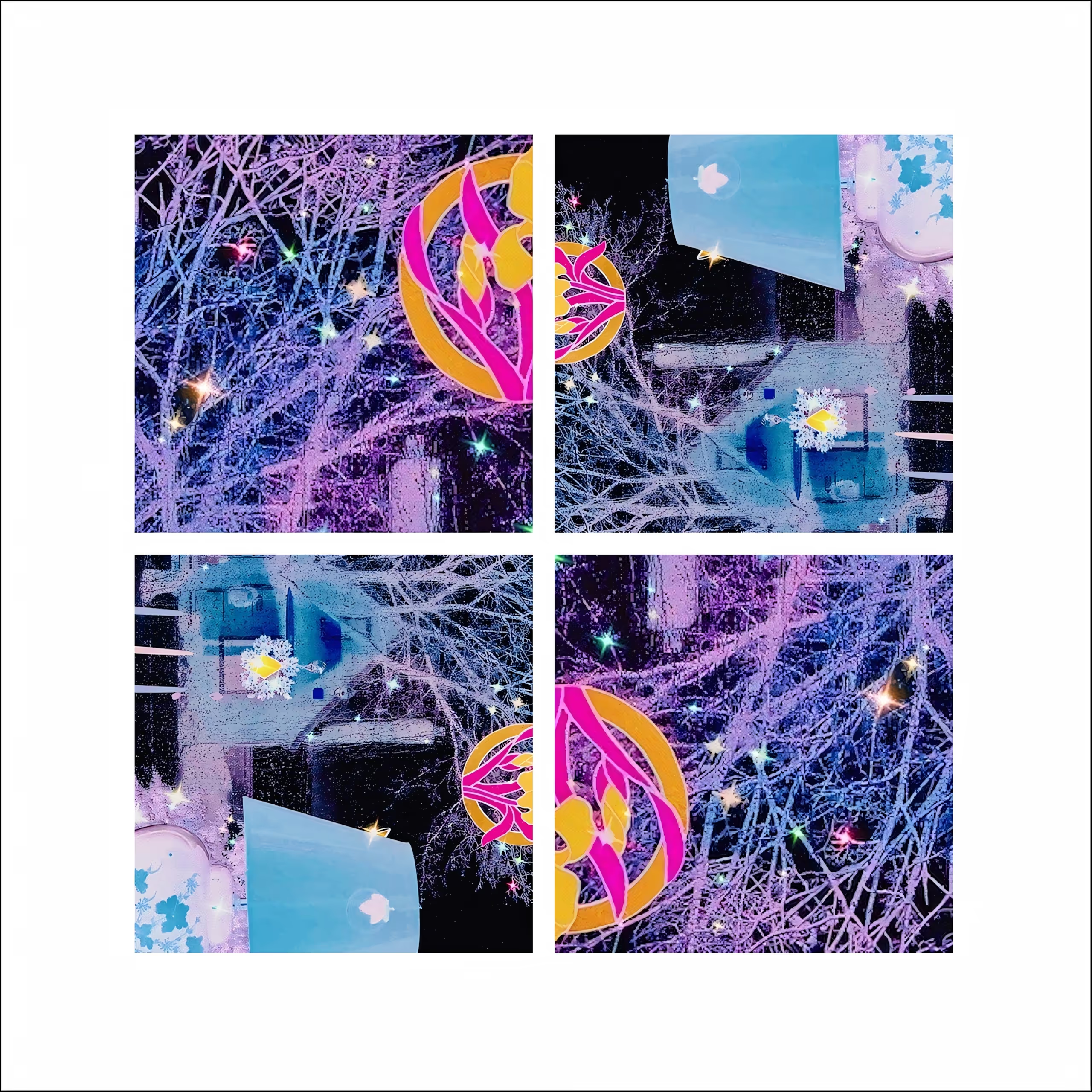
★★★ Snowy Night In Early Spring ★★★
Sylvia Bandyke, Royal Oak, MI, USA, is largely a self-taught photographer, having taken studio and art history classes in college. She began her art career by displaying photo collages in ArtPrize, an independent international art competition in Grand Rapids, MI, from 2014 to 2018. Subsequently, she has been juried into more than 100 group exhibitions in 24 states and accepted into numerous online international exhibitions. An awarded artist, she keeps an eye open for interesting views of a subject while looking for hidden beauty every day. Most recently, she was a caregiver to her elderly mother and was able to create some memorable, unique art as a result of this experience.
I prefer using the collage format to integrate associated images into a cohesive unit that is even more compelling because of the embedded story. Having been a playwright and technical writer, I am accustomed to delivering content with a message. So now, as a visual communicator, I continue to provide meaning via the structure of the collage format, wherein the four photos confirm, augment, or even contradict each other if warranted. I enjoy offering the richness that the multiplicity of images provides, along with the impact gained through thoughtful positioning of them. Ultimately, I intend to have my work act as a doorway to the viewer’s own mental and emotional framework regarding the collection of images, perhaps finding their own very personal meaning in them.