
★★★ Corporate Fairy Aura No 10 ★★★
Anna Mathai is a multidisciplinary artist based in San Francisco with a practice spanning from mixed media and painting to sculpture, decorative residential wall installations, and writing. She creates sculptural and textured works that use color, light, texture, and shadow to tell her story, and frequently works with plaster, textile, and metal. Her goal is to create things that hold some strange magic. It’s why she likes to experiment with and create new methods (like her “canvas kintsugi” and hardened silk origami). She makes works that interact with their viewers and the light around them, reflecting, shifting colors, and jumping off of the wall to mingle art and enjoyment, to transcend viewing into experiencing. She feels that the aesthetics (and a touch of whimsy) are paramount. However, on the “series level,” her work often references deeper themes from her life, such as rebellion, feminism, “otherness”, and the immigrant experience. Her work, however, is not overtly political. In her mind, her art generally reflects on boundaries, both real and imagined and blurs them.
Mathai was born in the UK to Indian parents but spent most of her childhood in the rural Deep South. She obtained a Bachelor of Arts from Rice University after graduating from the Louisiana School for Math, Science, and Arts, then went to medical school, and eventually law school, later practicing as an entertainment lawyer. Since pursuing her art professionally, her work has been featured in international art magazines and exhibited nationwide. In her other time, she writes lyrics and screenplays, enjoys nature with her Australian Shepherd, and Cowboy, and tests jokes on friends and family.
I create sculptural and textured works that use color, light, texture, and shadow to tell my story, and frequently work with plaster, textile, and metal. I want to create things that hold some sort of strange magic. It’s why I like to experiment with new methods and create works that interact with their viewers and the light around them, jumping out of the canvas to mingle art and enjoyment, to transcend viewing into experiencing. I feel that the aesthetic (and a touch of whimsy) is paramount, though on the “series level,” my works sometimes reference deeper themes from my life, including those of rebellion, feminism, and the immigrant experience. My work is not overtly political, and it would be unlike me to have one meaning for any single work—in fact, the exploration of dualities and the blurring of them is conceptually central to most of my art. Even in my poetic writing, I find beauty in the multiplicity and ambiguity of meaning. So, I prefer to avoid prescribing meaning to each work and let the viewer interact with it themselves, adding to the art with their own interpretation. It’s a sort of acceptance of all meanings: each one is true as it applies to you—I call it my “quantum art” philosophy. All that being said, in my mind, my work generally reflects on boundaries, both real and imagined, and blurs them.

★★★ En Busca De Mi Cicatriz ★★★
Julien Cardinal Romero was born on July 26, 1976, in Matanzas, Cuba. He fled to Panama City at the age of 35, fleeing the dictatorship that had oppressed his country for more than 60 years. He sought refuge in Panama City, where he spent ten years.
In Panama, Julien participated in a variety of artistic events, winning third place in its national salon in the painting category in 2019. He has always dedicated himself to art. He enrolled in his city’s Higher Pedagogical Institute in 1994 and graduated in 1999 with a Bachelor of Plastic Education. In 2001, Julien enrolled in his city’s Roberto Diago professional art school and graduated in 2004 as a Professional Technician in Plastic Arts.
During his student years, Julien was able to meet people from various generations. He uses a variety of techniques such as oil paints, acrylics, and pastel pens. Influences in his work include modern painting, the Cuban cinema poster artist, African art, expressionism, and surrealism.
My name is Julien Cardenal Romero. I am a Cuban artist. My work is a personal journey where the answers sometimes come before the questions in the form of art. Through my work, I study myself, my conflicts, and my internal struggle, and I employ art as a tool, as well as its history and influences. I use modern art, expressionism, surrealism, African art, Cuban movie posters, Ukiyo-e, and abstract expressionism as tools.

★★★ Everything Is Energy ★★★
I started painting after a career crisis in 2020. I was working as a healthcare professional and went through burnout, which led me to switch my career to business and finance. During the crisis, I needed something to let go of and process my feelings so I registered for a painting course. I just fell in love with making art! I love that I can do something with my hands, work with beautiful bold colors and express myself. Art saved me.
I create artwork that is meant to be a moment of inspiration and joy. My process is intuitive, I start by using bold colors and let my feelings guide me from there. I love the colors magenta and turquoise, and metallic paints. Bright and beautiful colors make me happy. My way of using contrasting details and multiple layers add texture that is unique to my artwork. With my artwork, I want to convey the message that we all need to love ourselves, take care of ourselves, and appreciate life! Everything happens for a reason and we should just travel within life`s current and trust. I want to bring beauty into homes and remind us of our own strength and the importance of love and gratefulness.
I paint with acrylic colors and my process is very intuitive and spiritual. My inspiration arises from many sources and strong colors are a big part of it. While painting, I let myself go and just paint without thinking too much and let the colors and my feelings guide me. I like to play with contrast and duality, texture, and add details to my artwork.

★★★ Fine Dining ★★★
Amy Lewis is a self-taught artist from Washington state. Her watercolor and oil paintings are vivid lifelike snapshots of ordinary life glamorized. Amy, inspired by fashion editorials and historic paintings of aristocracy, pairs everyday objects with rich backgrounds. The juxtaposition of the ordinary and the luxurious sparks an appreciation for the things we take for granted. She paints to cultivate joy and an appreciation for the beauty that is all around us.
My work is a practice of gratitude. It is the cultivation of joy and an appreciation for the beauty that is all around us. I’m constantly exploring ways to portray ordinary life as glamorous. Everyday objects with luxurious backgrounds create a juxtaposition that sparks an appreciation for the things we take for granted. In the beauty of the ordinary, I am reminded to be grateful and to use my privileges for the good of others. Fashion editorials and historic paintings of aristocracy are rich sources of inspiration. I work in watercolor and oil paints. For watercolors and oil paintings, alike, I paint roughly 3-4 layers. Many layers mean that the resulting painting has a smooth finish and vivid complex colors. Depending on the size, medium, and complexity of a piece they can take 1-2 days or 1-2 months. Most recently I am proud of being featured in Gita Joshi’s Art Seen Magazine and throwing my own group art exhibition in Seattle, WA.

★★★ Flirting With Joy ★★★
Alicia is a storyteller at heart and interpreting her visual tales, through her paintings, brings her great joy. These inspirations stem from Alicia’s symbolic imagination representing secret realms filled with magnificent depths of femininity and beauty. Alicia’s paintings are captivating, and her compositions are executed with intent and motive. “My portraits are linked together through precise and distinctive placements. I purposely fill the atmosphere with visual fragrances that linger in the air and connect with viewers as they personally identify with the unfolding narratives.”
I am convinced that each of us holds treasure hidden in the depths of our hearts. As a professional artist, it is my aim to provide images that help unlock these great treasures. The illumination of beautiful narratives has the power to resonate with the collector. The image reflects the truth, promoting a release of identity and value. As you view my work, take it in. Allow what might lay concealed to be realized.

★★★ Frozen Cactus ★★★
Yue Zeng is a Chinese-American self-taught artist, mother, and wife, who has been living in the United States since 2008 and currently resides in Woodbury, Minnesota. Zeng’s artistic practice focuses on oil painting, with her subjects mainly being mythical creatures and imaginary landscapes. With a style between impressionism and fantasy, she explores the vividness of their spirit in saturated colors and organic forms. Zeng’s interest in the arts started in elementary school, sparking her desire to create later in life. In her twenties, she obtained her Master in Science from SUNY College of Environmental Science and Forestry in Syracuse, New York. In 2017 due to physical complications, Zeng had to leave the chemistry industry. Transformed by the experience, she decided to revisit her art practice and make it her career regardless of the obstacles she would face. Since then, Zeng has flourished in her artistic expression, finding her true passion in oil painting. Although Zeng explores other painting mediums such as gouache, pastel, and digital, oil and canvas feel the most natural. This medium allows her to relax and be free with the changeability of the material and exploration of color within the subjects she paints.
My paintings are an outlet to express the imagination I have inside my head that I can not put into words. After trying many mediums, I always find myself coming back to paint and brushes. In my current artistic practice, I use oil paint and mainly create portraits of mythical creatures and animals transfixed in the shifting colors of seascapes and landscapes. There is a natural spirit and magic to these creatures and their energy draws me in. Choosing to paint these creatures as real living wildlife rather than abstractions, I use bold and vivid colors to express the imagination intertwined with reality, finding magic between the seams. Using a saturated color palette, I create bold and striking imagery, contrast between foreground and background, subject and landscape, and light and darkness. Weaving their bodies and the surface of the landscape into each other through organic forms and flowing brush strokes, I find beauty, strength, and innocence in these creatures that reflect my inner world.
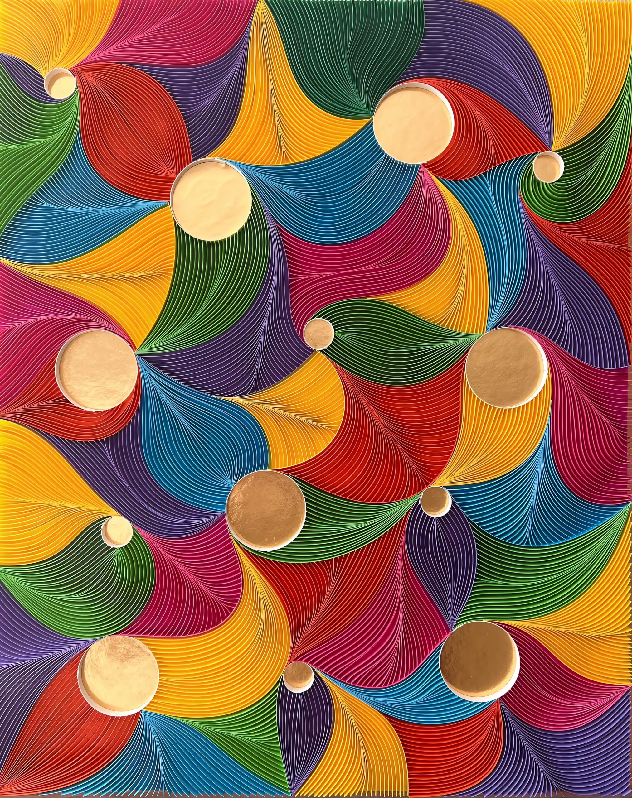
★★★ Golden Kaleidoscope ★★★
I’m a paper artist deeply inspired by nature, culture, and personal connections. Using the ancient art form of quilling, I transform strips of paper into intricate, vibrant compositions that tell meaningful stories. Originally from India and now based in the U.S., I blend traditional techniques with modern aesthetics, often collaborating with illustrators to add depth and emotion to my work. Each piece is a reflection of my journey—rich in color, texture, and intention. From wall art to fine jewelry, I create with the hope that every design evokes joy, curiosity, and a sense of wonder. My work has been part of gallery exhibits, art shows, and cherished as personalized gifts that celebrate love and identity. Whether it’s a Tree of Life, a mandala, or a custom initial, my art is a quiet offering of beauty in a fast-paced world. I believe in the power of handmade and in making art that connects people deeply.
In a world teeming with patterns, where chaos and structure intermingle, my dual passion as an engineer and artist is ignited. Fascinated by the harmony that emerges from shapes and colors, I found my medium of expression in the ancient art of quilling. Through Paper Sweetly, born in 2016, I embarked on a creative journey that began with paper jewelry and expanded to encompass a diverse range of art forms, from earrings and necklaces to wall art and sculptures.
Within the confines of my San Jose home studio, I immerse myself in the process of translating my perceptions, moods, and glimpses of inspiration into tangible creations. With each sketch, color selection, and delicate curling of paper, I witness the transformation of intangible ideas into exquisite reality. The entire journey, from inception to completion, fills me with an overwhelming sense of joy and relief from stress.

★★★ Hiding ★★★
Roberta Rousos has lived 2 lives in her 59 years; as a wife, mother, and community volunteer; and as an artist (and mom). After her husband’s death, she returned to CSU Sacramento earning a BA and MA Degree in Studio Art.
Rousos’ work can be traced to her graduate studies when she added fiber to steel integrating both her metal shop teacher father and her homemaker mother. Her work focuses on seemingly opposing materials.
Rousos’ exhibition sphere now includes galleries in her home state of California, Michigan, New Mexico, Washington, Illinois, New York, Colorado, and Oregon.
She considers herself blessed to be able to be an artist. She firmly believes that we all choose daily what life we are willing to live and our priorities. Rousos chooses to live on the line between the physical reality of this world and the spiritual realm. She decides to appreciate the beauty around her and encourages others to do the same. Life is good if you allow it to be.
I am a mixed media artist: found objects, fiber, and oil painting. Returning to college following the passing of my husband allowed me to discover new paths in creative expression. Earning my Bachelor’s and Master’s Degrees showed me how strong I could be and where my life’s passion lies.
When coping with life’s traumas, we are often told to take baby steps or to live one day at a time. This is good advice, but not just for when we are suffering. We each have years behind us and hopefully years ahead, but we can only live today. Today is what we can truly see in detail; this moment is what we can affect; now is when we can live. Take a step today.
I come from a long line of artisans and crafters. As a creature of opposites, I constantly struggle to integrate chaos with logic, gravity with freedom, and reality with dreams. My work continually evolves because of my desire and choice to live a life of purpose.

★★★ Hope ★★★
Irina Howard is a New York-based artist whose work explores the complexity of human life experiences. She is internationally recognized for rigorously composed and sublimely musing paintings and sculptures. Her innovative style is inspired by organic forms and textures bridging reality and imagination, giving a physical form to a conceptual idea, and revealing the visible within the invisible.
Howard was born and grew up in Ukraine. As a child, she encountered traumatic events that influenced her to interact with the world through her drawings. Her youth Howard spent in the elite cultural group committed to arts and literature, where she established her lifelong passion for the arts. By lifting the burden off her shoulders, she emerged with the personal belief that the artist has no right to contribute any more pain to a world full of struggle and despair, which kept her in artistic silence for several years. Moving to the United States, exploring different careers, and then heading into a midlife crisis significantly changed her perspectives and led to a creative awakening. Her real-life experiences of grief and hope found reflection in her current series of works. Howard studied fine arts and graduated with honors from the City University of New York and Yale Gordon College of Arts and Sciences.
Irina Howard is a recipient of several awards. Her recent recognitions: “Oscar of Visual Arts” as Top 60 Masters of Contemporary Art in 2022 by Art Tour International Magazine. Her work has been widely published in magazines like Aesthetica, the Art & Culture Magazine, Art Ideal Contemporary Aesthetics Magazine, and art books worldwide, including Important World Artists by Worldwide Artbooks. Her most recent exhibitions are at Art San Diego in California, and Hamptons Fine Art Fair in New York, USA. Her work highlights multiple private collections internationally.
“Patterns of Life” is a black-and-white collection of paintings and sculptures communicating life experiences and human values. The choices we make in life shape our identity and motivate our future behavior. By illustrating both positive and negative outcomes, I encourage the viewer to believe in themselves, be their best, and look for a positive change.
I draw inspiration from organic texture and compose my themes by giving physical form to a conceptual idea, bridging reality and imagination in the form of artistic beauty and revitalizing energy. My fascination with forms and textures takes me on a journey to reveal and interpret their meaning, unique purpose, and beauty in connection to human experiences. The creative use of symbols illustrates visual metaphors and offers insight into an idea or a concept from a different perspective.
My processes combine research, thoughtful, conscious decisions, and spontaneous, intuitive solutions while creating compositions. I realized that abstract style is my best form of artistic expression. It opens doors for curiosity, imagination, interpretation, and the flow of inner emotions. The development stage is very exciting. Lines – help me to create feelings; shapes and forms – to reflect emotions, thoughts, and perception; texture – to reveal experiences; color tones – to add contrast and reinforce the message through design and composition.
My favorite elements are circles and curved lines. I found them simple but, at the same time, very compelling. The circle is a line that never stops, represents “completeness,” and gives a sense of protection, friendship, femineity, community, and perfection. It naturally communicates positive emotions and builds a strong visual identity. In my work, circles often symbolize hope.
My body of work expresses personal experiences, thoughts, spirituality, feelings, and philosophy in life. I always strive to inspire hope and encourage positivity.